
02 Apr Q4 – SS27 Colors: Balancing Escapism with Grounded Reality
As we look toward the Spring/Summer 2027 fashion cycle, the color landscape is defined by a dynamic tension between digital fantasy and a deep craving for natural grounding. Consumers are oscillating between expressive, high-chroma joy and the calming reassurance of tactile, earth-bound neutrals.
For retail color managers and product development teams, SS27 offers a versatile playground. Whether you are developing technical activewear or elevated resort collections, this season’s palettes demand thoughtful application, prioritizing fluidity, functionality, and emotional resonance.
Here is your comprehensive breakdown of the defining macro-trends for SS27.
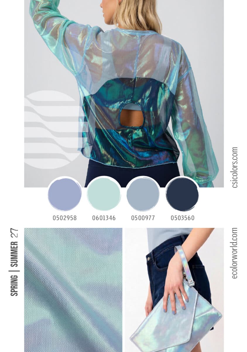
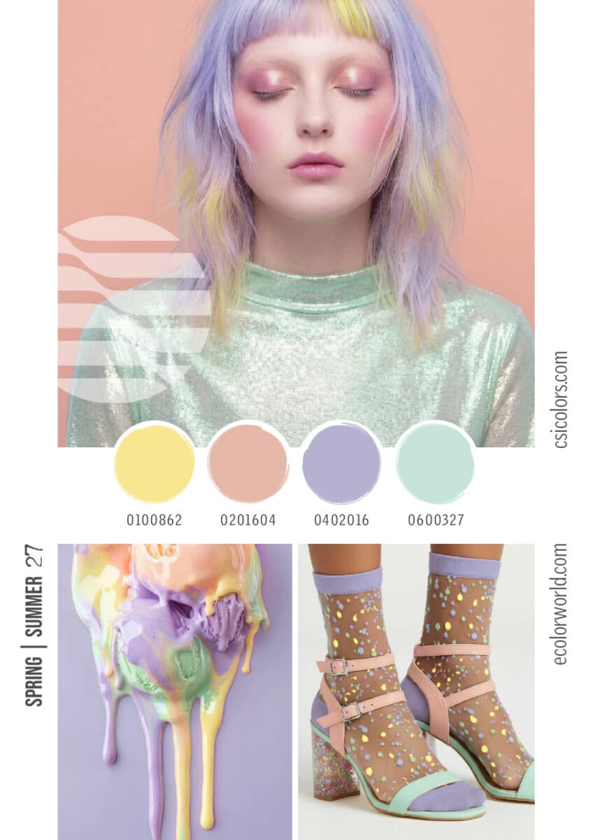
- Digital Dreamscapes & Whimsical Pastels
Moving away from traditional sugary spring tones, the new pastels are hyper-tactile and slightly surreal, drawing inspiration from digital environments and iridescent light play.
- The Palette: Pale, luminous yellows, cool mints, and soft lilacs merge with ethereal seafoam greens and periwinkles.
- Key Applications: This story relies heavily on material innovation. Think sheer overlays, holographic accessories, and high-shine synthetic fabrics. These tones work beautifully for playful footwear, sheer hosiery, and futuristic resort wear, offering a sense of weightless escapism.
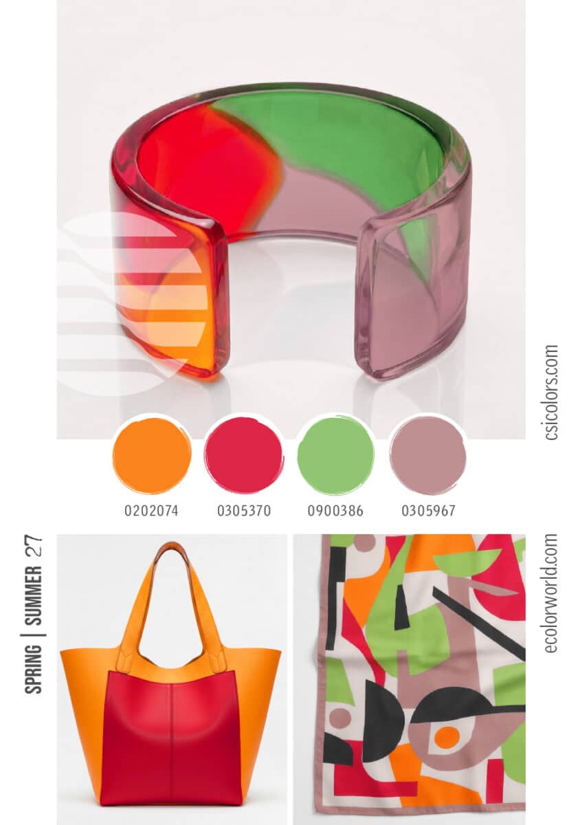
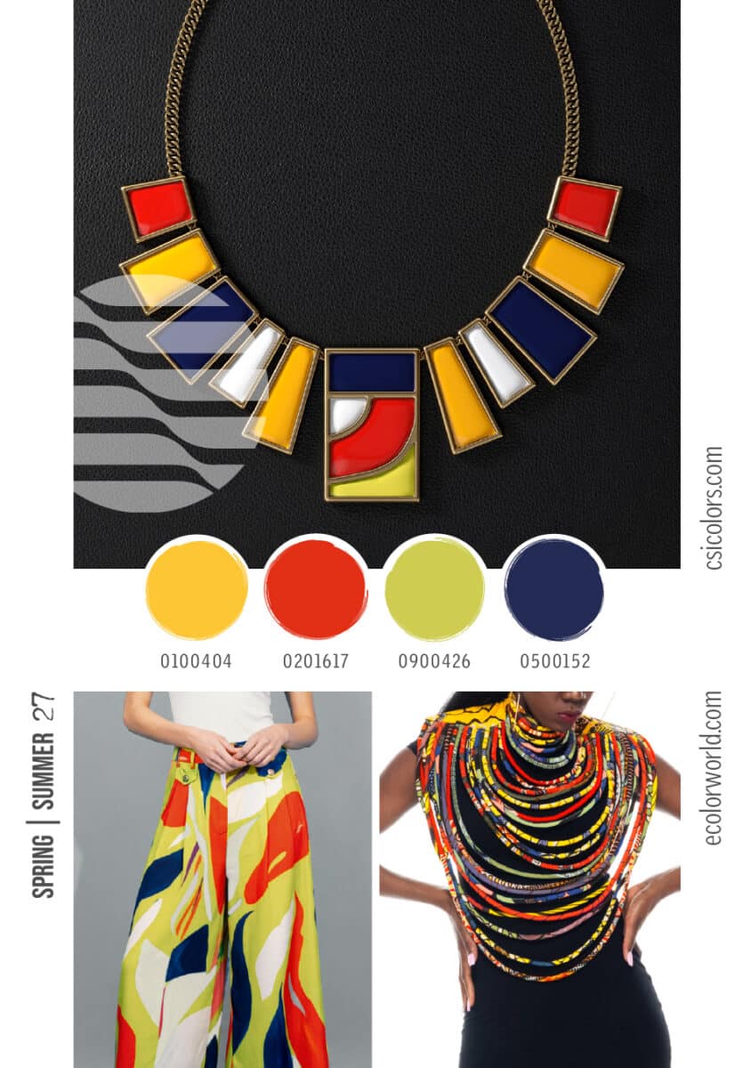
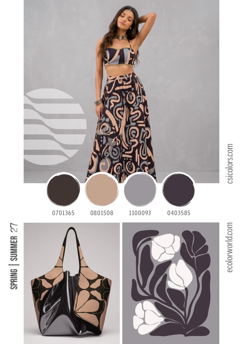
- Expressive Vibrancy & Cultural Chroma
SS27 brings a resurgence of unapologetic, high-energy color designed to make a statement. This trend moves away from cautious tonal dressing into bold, optimistic color-blocking.
- The Palette: Saturated marigold yellows, striking tomato reds, vibrant chartreuse, and deep, grounding indigos.
- Key Applications: This high-contrast palette is perfect for striking geometric prints, bold accessories, and statement jewelry. Expect to see these energetic tones driving capsule collections, graphic resort wear, and oversized summer accessories.
- Grounded Utility & The Botanical Earth
The gorpcore influence continues to evolve, maturing into a sophisticated, nature-inspired utility aesthetic. This trend speaks to outdoor exploration and traditional craftsmanship.
- The Palette: Rich terracotta’s, warm ochres, deep olive greens, and sunbaked khakis, accented by dark, loamy browns and deep burgundies.
- Key Applications: Function dictates form here. These colors are essential for tactical menswear, strappy outdoor footwear, woven accessories, and linen sets. The appeal lies in matte finishes and durable, tactile fabrics that feel organically derived.


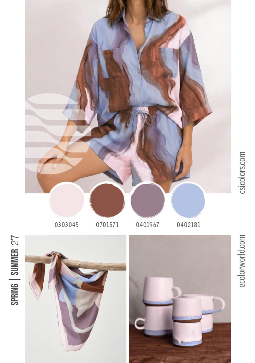
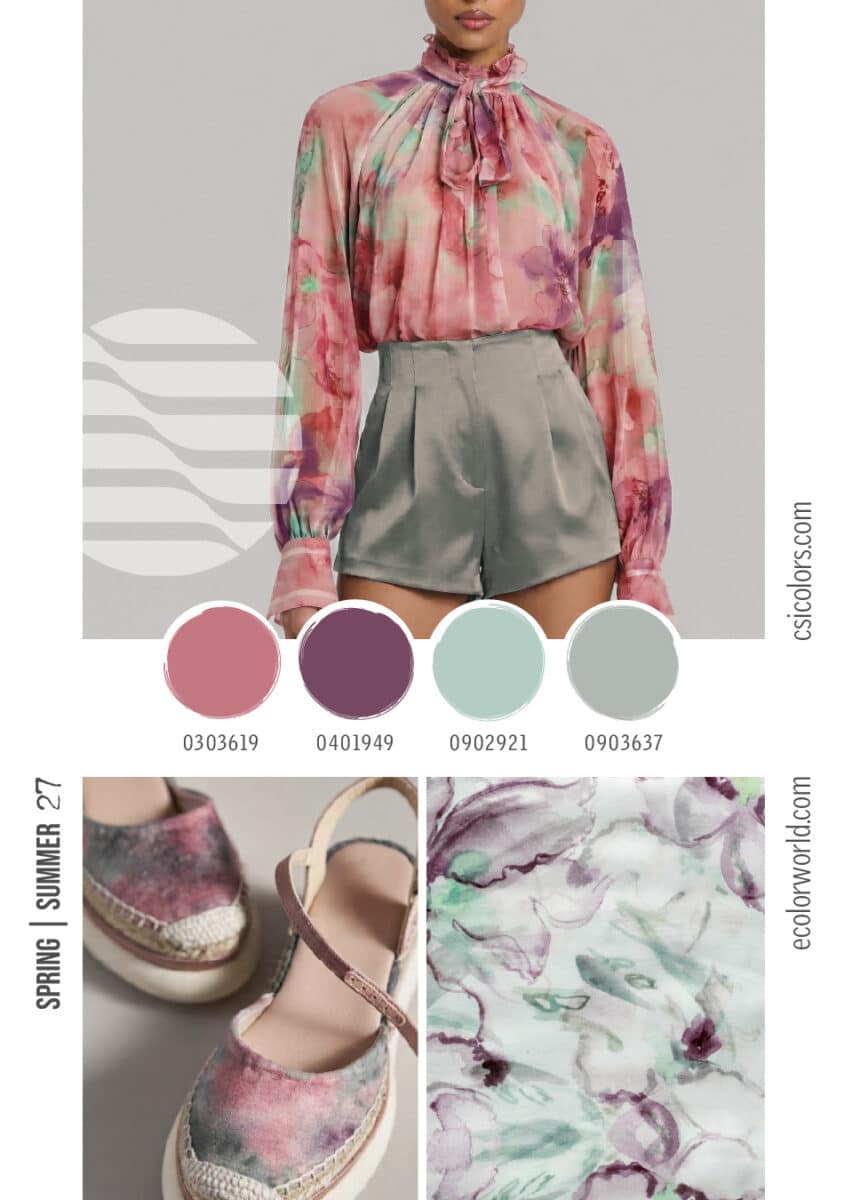
- Fluid Sophistication & Elevated Resort
A softer, more romantic approach to the season emerges through fluid prints and sophisticated, high-contrast neutral pairings that feel effortlessly elegant.
- The Palette: Dusky watercolor pinks, soft rusts, muted mauves, and elegant seafoam greens, grounded by stark charcoals and warm beiges.
- Key Applications: This is the core palette for elevated summer elegance. It translates seamlessly into watercolor floral blouses, silk shorts, soft ceramics, and graphic abstract prints. The focus is on drape, movement, and a relaxed, unconstructed silhouette.
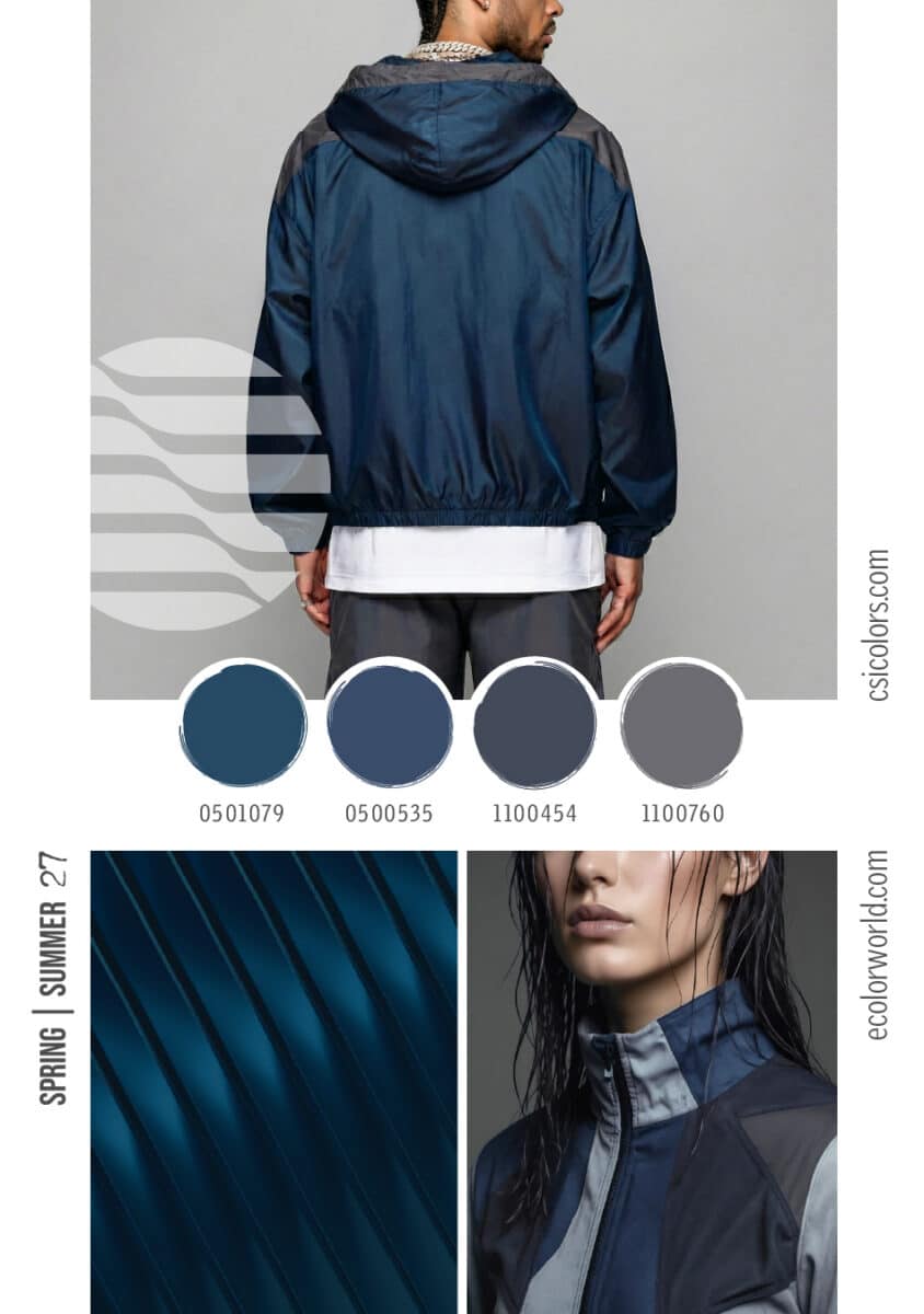
- Urban Activewear
Even in the height of summer, there is a need for sleek, moody tones specifically tailored to the technical and activewear markets.
- The Palette: Deep teals, saturated navies, and a gradient of slate and medium greys.
- Key Applications: Driven by performance fabrics, this palette is central to windbreakers, technical outerwear, and sleek metallic textures. It offers a cool, urban counterpoint to the season’s warmer, more vibrant stories.
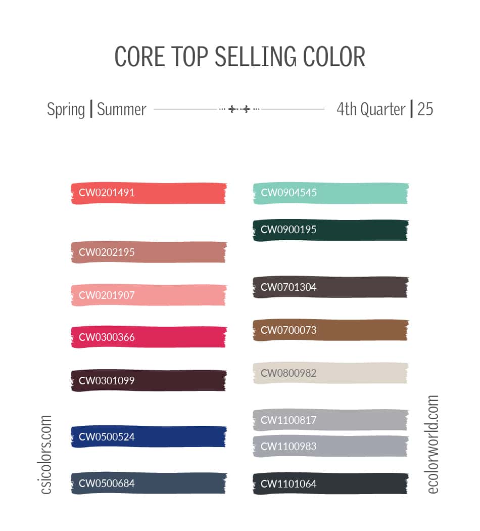
Aside from the popular Seasonal colors, the colors below from Q4 are a part of our Top Selling or Timeless Color reports and are popular across all seasons and palettes. To find out more about these, check out our Color Reports section.
To find out more about what CSI offers, please visit csicolors.com