
06 Mar Q4/25 Color Progressions: A Three-Year Color Comparison
Staying ahead of the curve in the consumer market requires more than just intuition; it requires data-driven insights. By analyzing the Color Quarterly report, designers gain a competitive edge by understanding how seasonal palettes evolve.
Using our innovative Relative Color Popularity technique, we have tracked the shifts in color choices made by leading brands and retailers through their ColorWall™ selections from Q4/2023 to Q4/2025. This three-year comparison reveals intriguing transformations and emerging shades that can energize any creative project.
By tracking the evolution of specific color families from 2023 through 2025, we can see a clear transition from earthy, organic origins toward more synthetic, high-clarity, and “digital-first” hues.
Here is the breakdown of the Q4 color progressions across the major palettes.
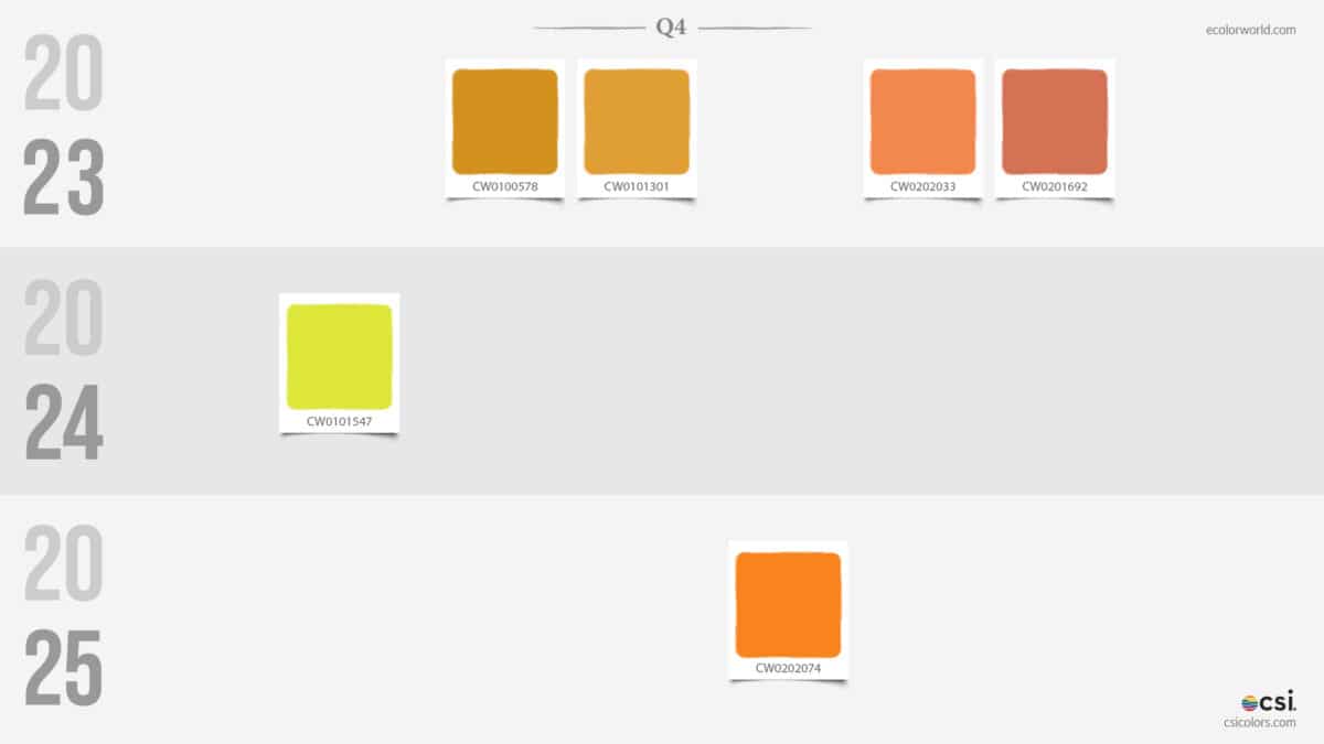
The Warm Spectrum: From Harvest to High-Voltage
The most dramatic shift occurred in the Yellow and Orange families. In Q4 2023, the palette was rooted in “Harvest” tones—mustards, pumpkins, and terracottas. By 2024, this shifted toward a singular, electric chartreuse (CW0101547), signaling a move away from the organic. By 2025, the warmth returned but in a much cleaner, more synthetic “Safety Orange” (CW0202074).
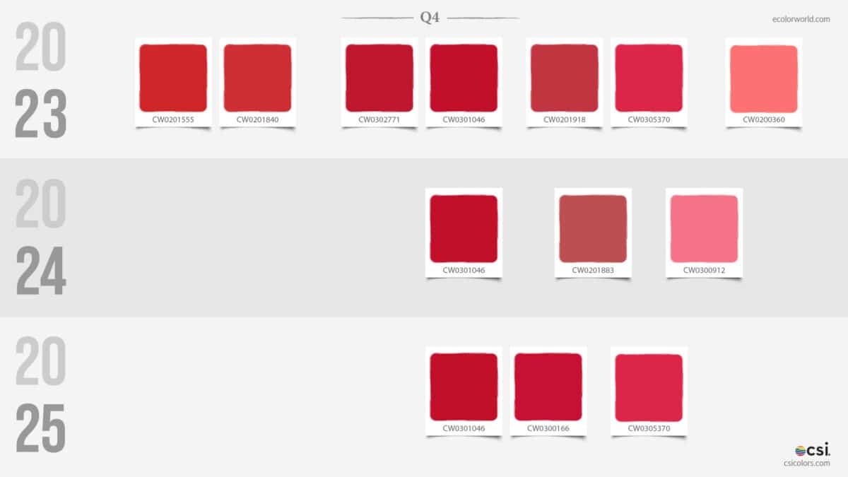
Reds and Pinks followed a similar path of refinement. The wide, somewhat muddy range of 2023 narrowed significantly. We’ve moved away from dusty roses and toward punchy, clear magentas and saturated berry tones. By 2025, the “Red” category is no longer about traditional crimson; it’s about high-visibility vibrancy.
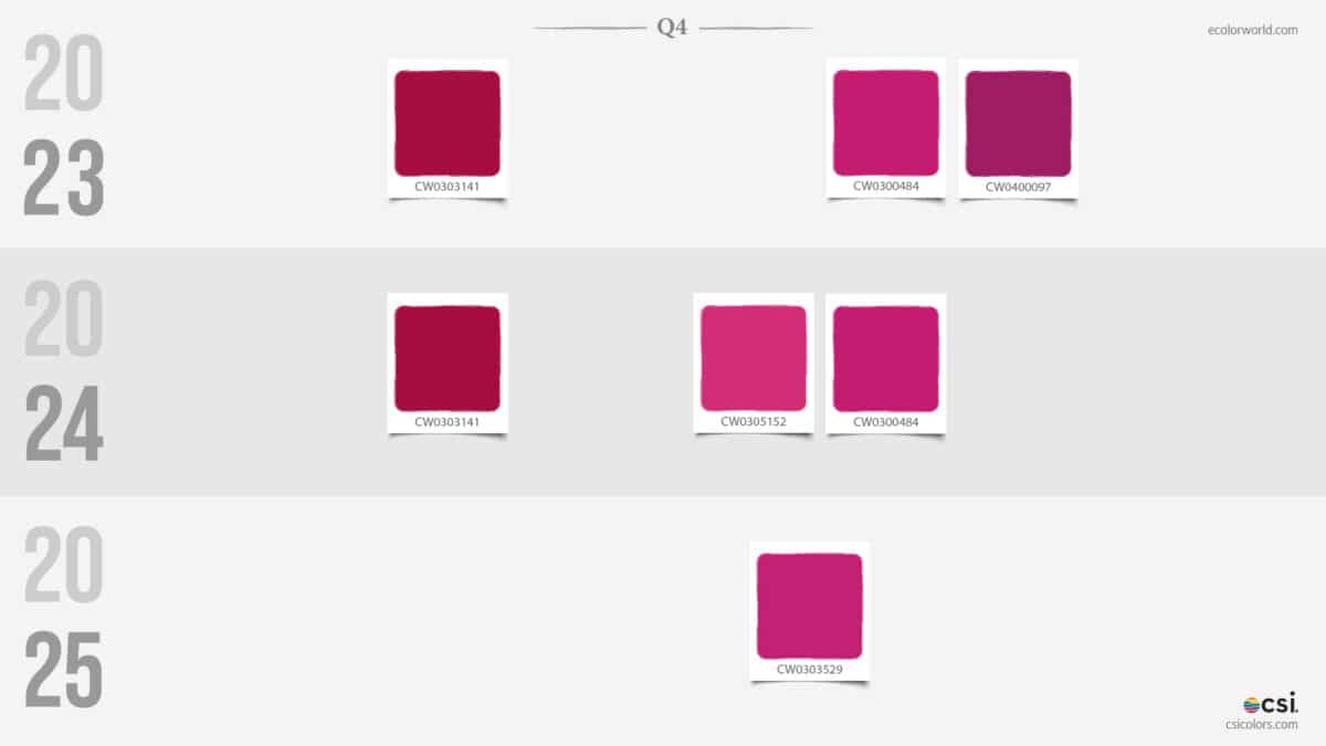
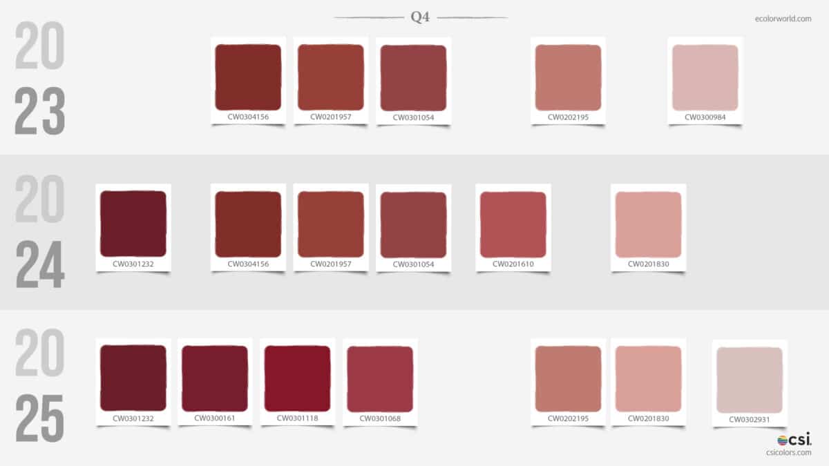
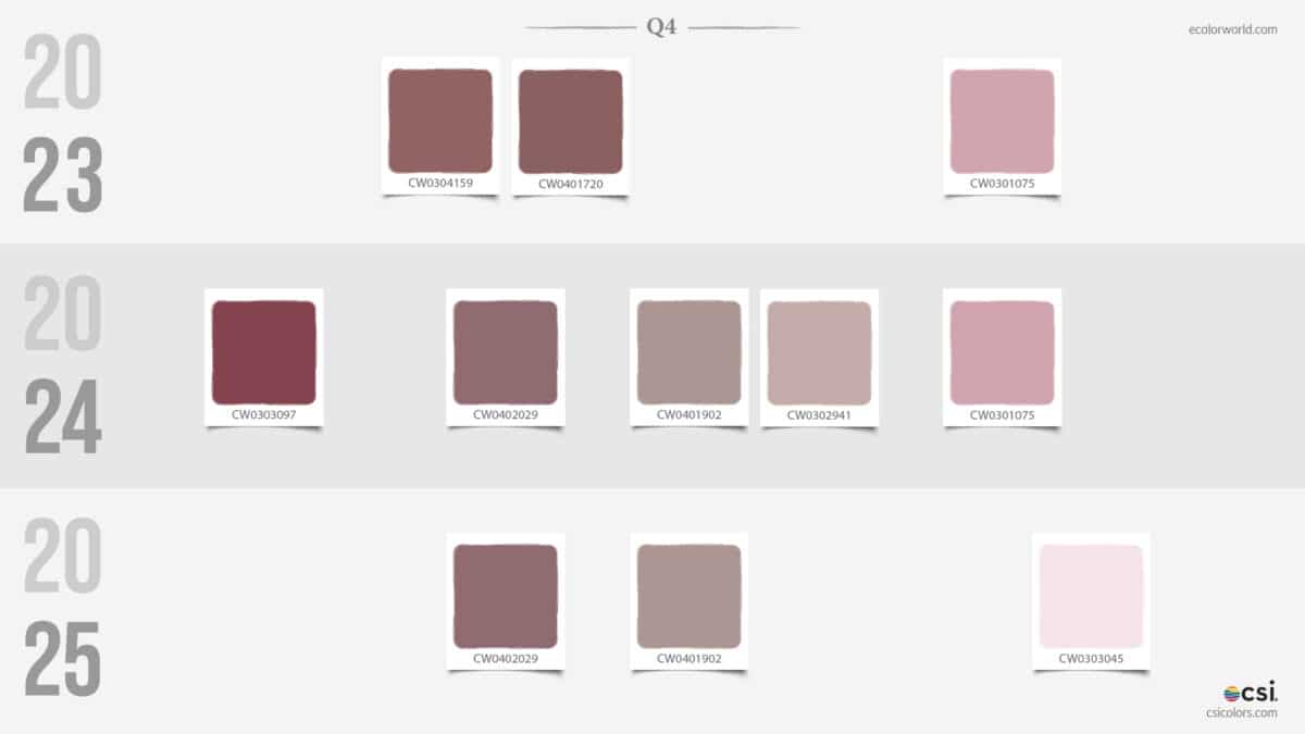
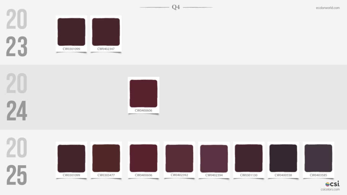
The Deepened Florals: The Maturation of Burgundies and Muted Mauves
While the bright reds and oranges of the Warm Spectrum are becoming more synthetic, this category acts as the crucial bridge between those high-voltage hues and the deep shadows of the palette. In 2023, these tones felt grounded and clay-like—think dried terracotta and dusty vintage floral prints.
By 2025, however, they have undergone a “maturation” process. The reds have been compressed into dense, inked burgundies, and the mauves have shed their brownish warmth in favor of a cooler, more “industrial stone” finish. This transition marks the exact point in the Q4 report where the palette stops being about the sun and starts leaning into the shadows.
A standout moment in this evolution is the replacement of the 2023 “nude” pink with a sharp, frosted pale pink (CW0303045) in 2025. It’s a clean, high-clarity highlight that cuts through the increasingly moody surroundings, signaling that even our “soft” colors are becoming more crystalline and digital.
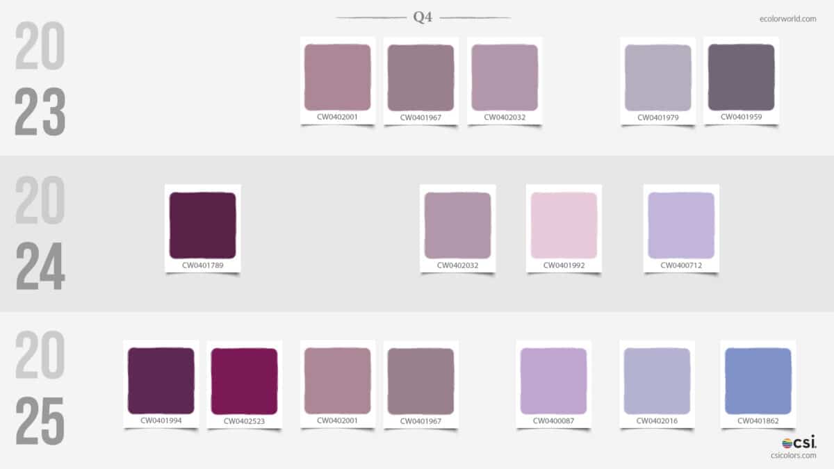
The Deep Tones: The Rise of “Dark Academics”
The Purples and Plums have seen a massive expansion in volume. While 2023 and 2024 featured only a handful of dark options, 2025 shows an explosion of deep, near-black eggplants and midnight plums (such as CW0403585). This suggests a Q4 trend leaning heavily into moody, sophisticated, and immersive dark palettes.
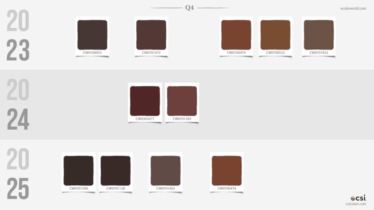
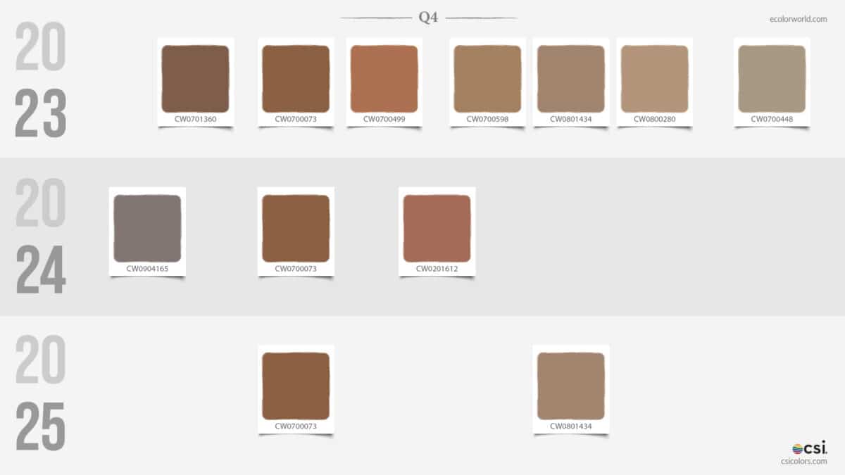
Browns and Earth Tones have also deepened. The “Caramel” and “Ochre” tones that dominated 2023 have been replaced by “Espresso” and “Dark Chocolate” in 2025. The warmth is being sucked out of the browns, replaced by cooler, more industrial wood and stone tones.
The Cool Spectrum: From Sea to Sky
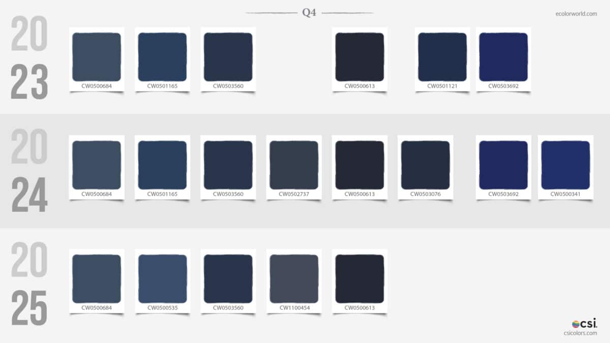
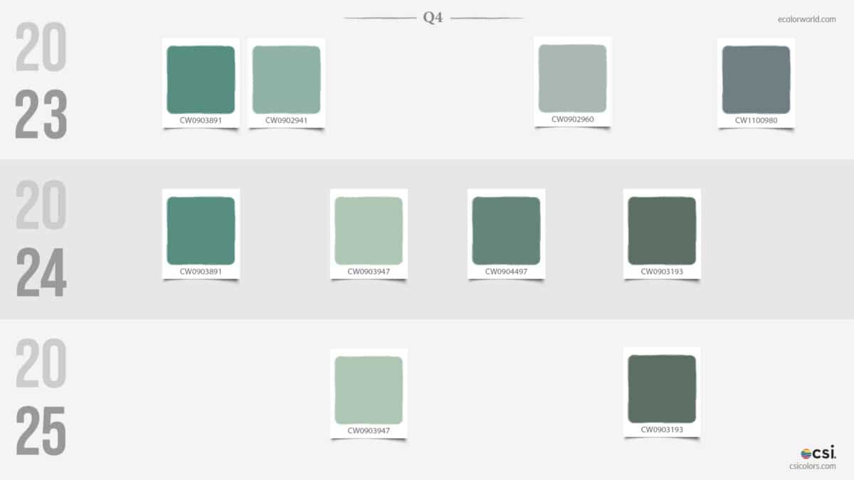
The Blue and Teal families have transitioned from “natural water” tones to “atmospheric” tones.
- 2023: Heavy on classic navies and seaweed greens.
- 2024: Introduced a “Dusty Petrol” influence—muted, gray-heavy blues.
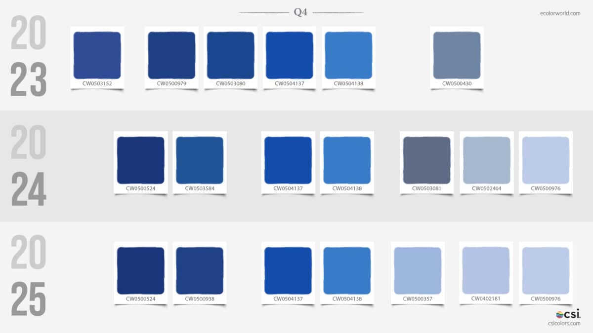
- 2025: A split has emerged. We see extremely dark, inky navies on one side and frosted, crystalline sky blues (CW0601236) on the other. The “middle” blues are disappearing in favor of these high-contrast extremes.
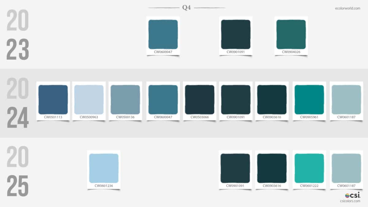
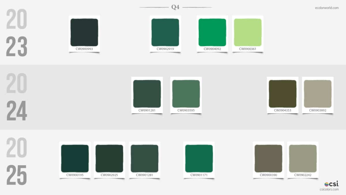
Greens have evolved from soft sages into a dual-threat palette. Q4 2025 showcases both a very deep “Black Forest” green and a vibrant, digital “Teal-Turquoise” (CW0601222). The “Olive” tones of the past are being sharpened into more defined, jewel-toned emeralds.
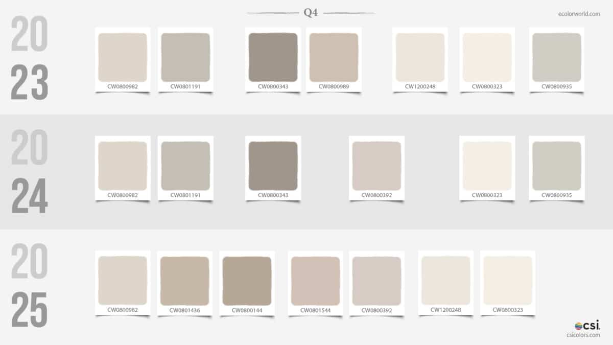
The Light Spectrum: From “Biscuit” to “Mist”
- 2023: The Organic Foundation was dominated by “edible” neutrals. Tones like CW0800323 and CW1200248 have heavy yellow and peach undertones. These are “cozy” colors—think unbleached linen and warm oat milk.
- 2024: The Great Thinning. Interestingly, 2024 saw a reduction in variety, focusing on a few core, mid-range beiges. It felt like a transition, shedding the excess warmth of the previous year.
- 2025: The Airy Expansion. By 2025, the light neutrals have returned in force, but they’ve lost their “yellow” base. We see the rise of CW0801544, which has a subtle mauve lean, and CW0801436, which feels like wet stone. These neutrals have moved from “Warm Cream” to “Cold Parchment.”
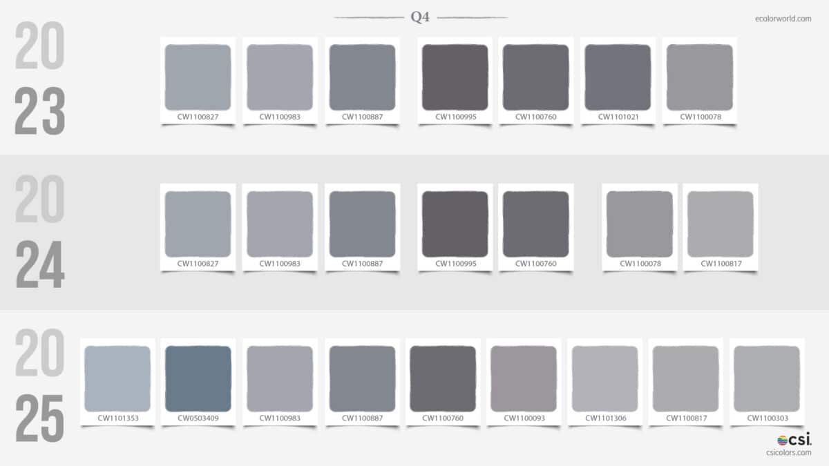
The Achromatic Shift: The Proliferation of Gray
- 2023: Functional Minimalism. The gray offerings were sparse and purely functional. There was a mid-tone, a dark tone, and a near-black.
- 2025: Total Immersion. It is nearly double the size of the previous years. We aren’t just seeing “gray”; we are seeing a massive diversification of Cool Grays and Steels.
- Blue-Toned Grays: Codes like CW1101353 and CW0503409 have entered the mix, suggesting that neutrals are now being influenced by the “Cool Spectrum” (Blue/Teal) evolution.
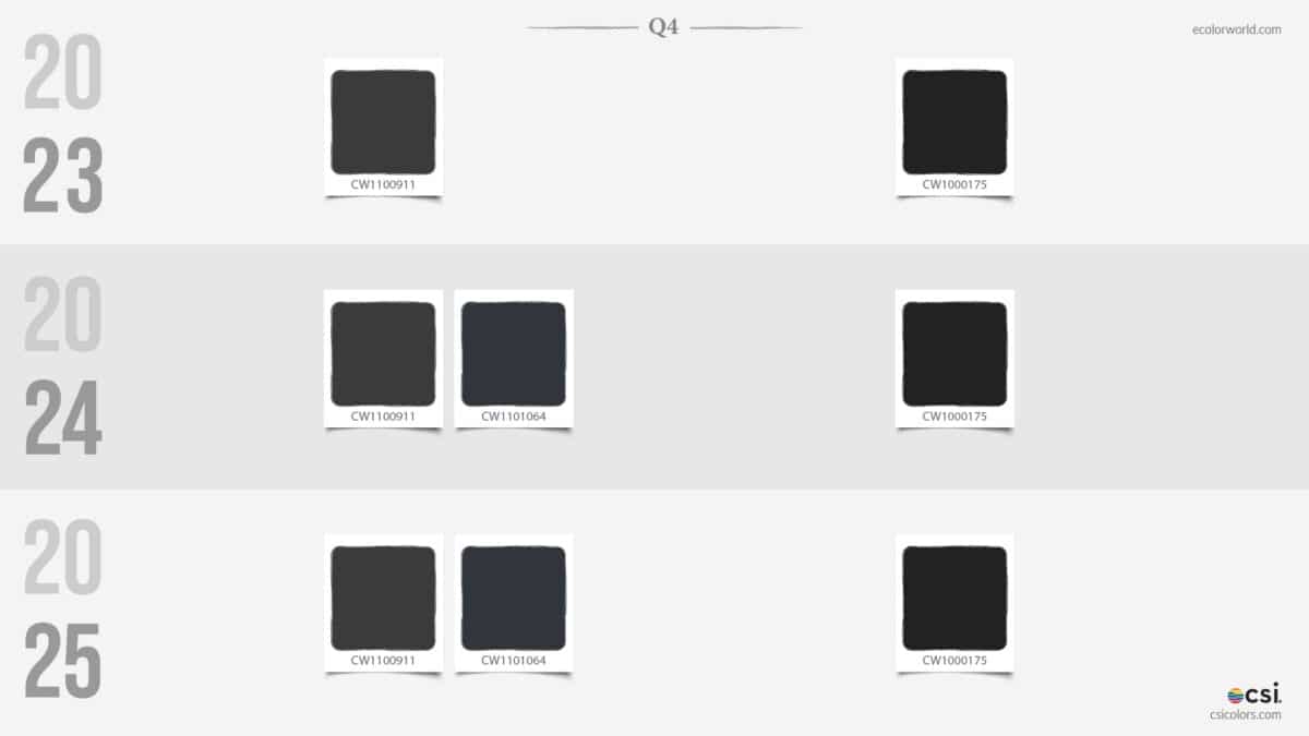
- The Depth of Black: The “near-blacks” (CW1100911 and CW1101064) have become more stable and consistent across the years, acting as the permanent anchors for an otherwise shifting palette.
Key Color Family Evolutions
- Synthetic over Organic: We have moved away from “found in nature” colors (terracotta, sage, mustard) toward “digital-native” colors (neon lime, vibrant orange, electric teal).
- Increased Saturation in Darks: The 2025 palette is significantly “heavier” at the bottom, with a massive increase in the variety of near-black purples, blues, and greens.
- The Death of “Muddy” Tones: Mid-tone, dusty colors (like the dusty roses and muted ochres of 2023) are being phased out in favor of high-clarity, “pure” pigments.
- Polarization: The middle ground is shrinking. Q4 trends now favor high-contrast pairings—combining extremely dark “Midnight” tones with “Frosted” or “Electric” accents.
To find out more about what CSI offers, please visit csicolors.com