
09 Oct Q3/26 RCP: Top Performing Colors
As we analyze the performance data from Q3 of 2026, 53 distinct colors have emerged as the foundational drivers of retail success. Rather than viewing these highly popular hues in a vacuum, we have projected their trajectory across the upcoming seasonal forecasting cycles. By grouping these performing colors into targeted color palettes, we can bridge current consumer purchasing behavior directly into the Spring/Summer 2027, Fall/Winter 2027, and Spring/Summer 2028 design calendars.
Spring/Summer 2027: Nuanced Lightness & Warm Blooms
Spring 2027 emphasizes a fresh, airy approach, balancing grounded, barely-there neutrals with soft, warming pinks and aquatic blues. The season indicates a shift toward refined basics, where warm Butter and Taupe provide a clean slate. Floral and sunset-inspired shades like Dusty Coral and Deep Blush create an inviting, energetic warmth, while a suite of airy blues—ranging from Cornflower to Pale Aqua—offers necessary visual relief and a nod to digital aquatic environments.
Nuanced Neutrals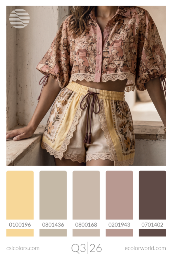
Warm Bloom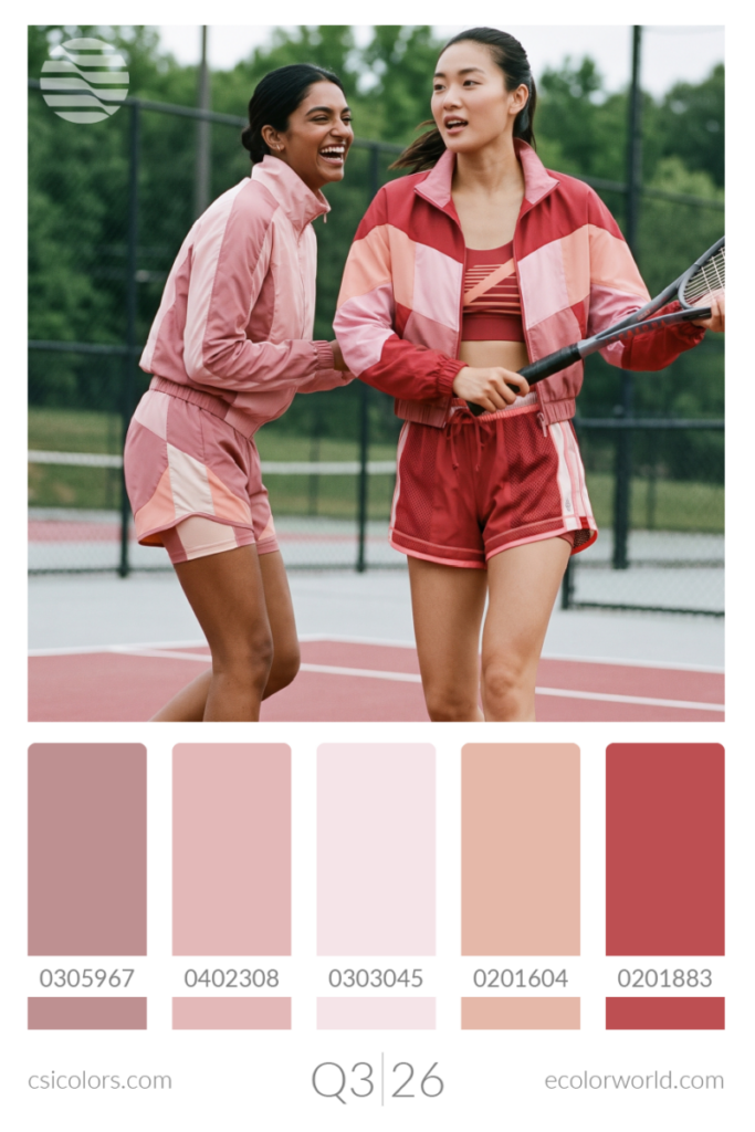
Airy Aquatics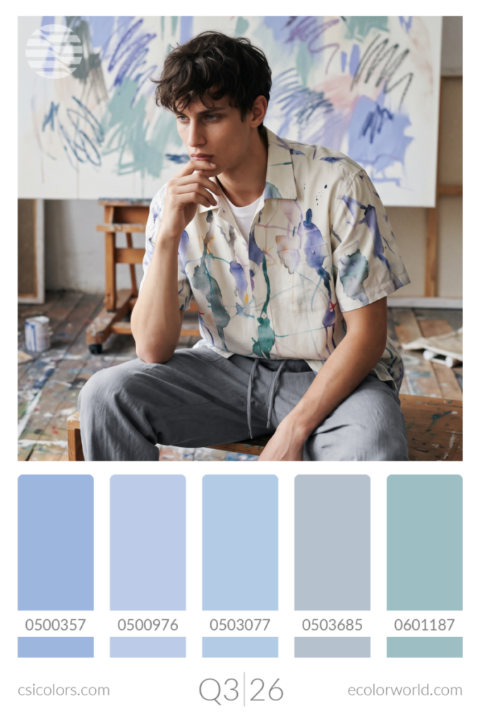
Fall/Winter 2027: Rich Earth, Jewels & Moody Depths
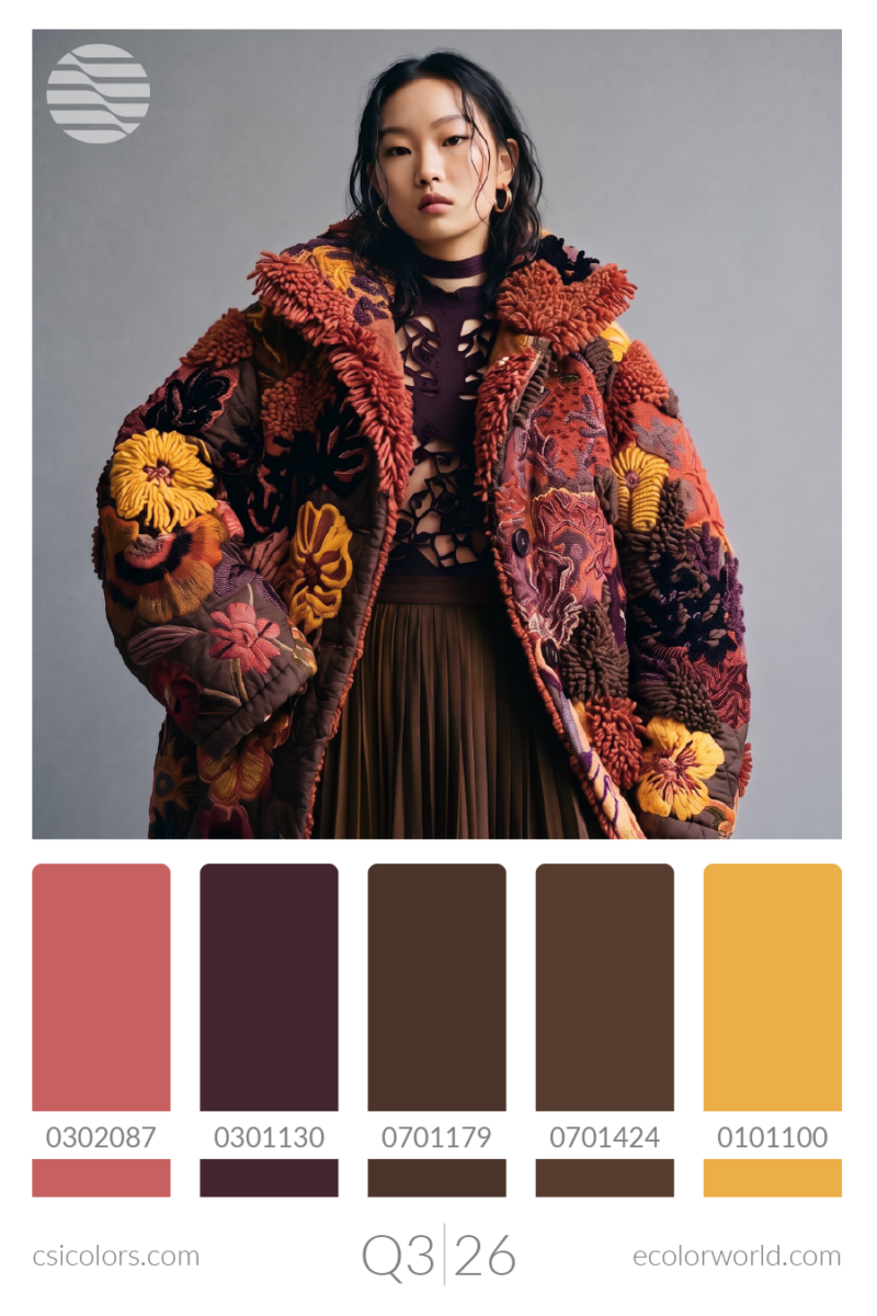
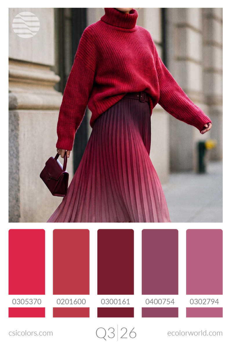
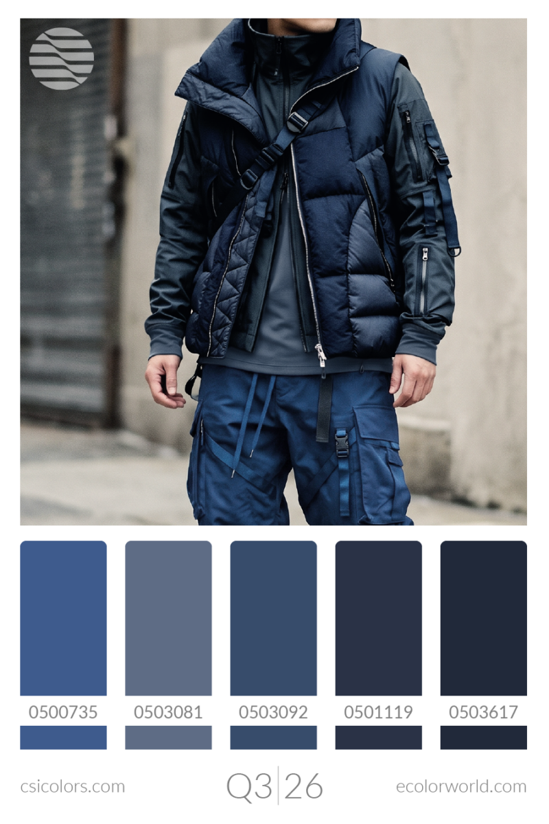
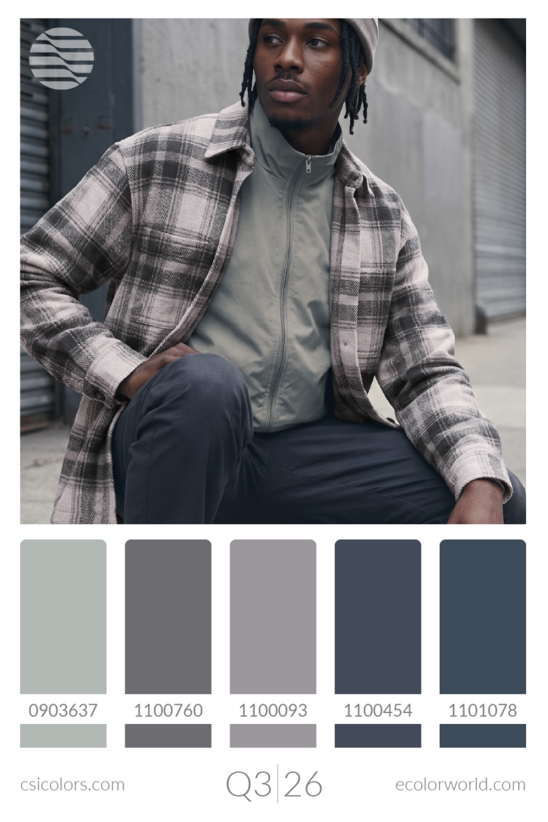
As we transition into the FW27 retail landscape, collections lean heavily into saturated, opulent shades and grounded, utilitarian darks. Chocolate brown and rich Mustard establish a warm, earthy foundation. Deep jewel tones like Burgundy, Magenta, and Plum act as the season’s primary statement accents. Meanwhile, tailoring and foundational outerwear will rely on Moody Blues—spanning Navy to Dusty Denim—alongside industrial, sober neutrals like Dark Slate, Ash, and Silver.
Grounded Earth
Deep Jewel Tones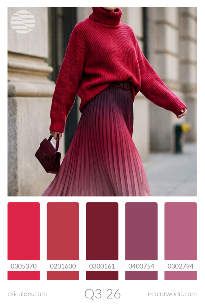
Moody Blues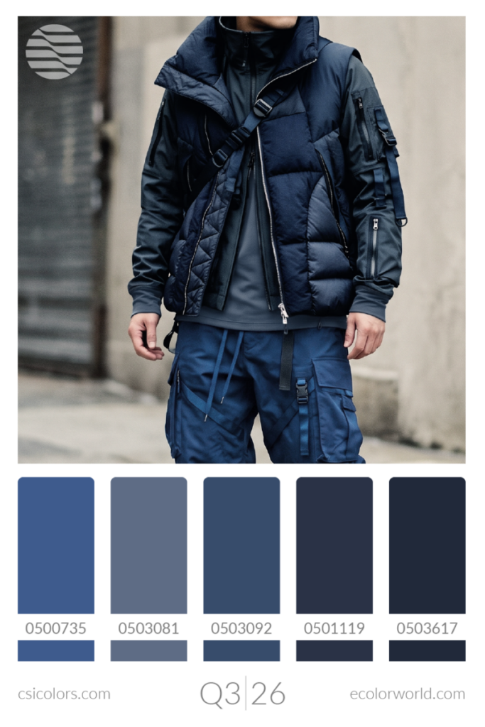
Smoke & Stone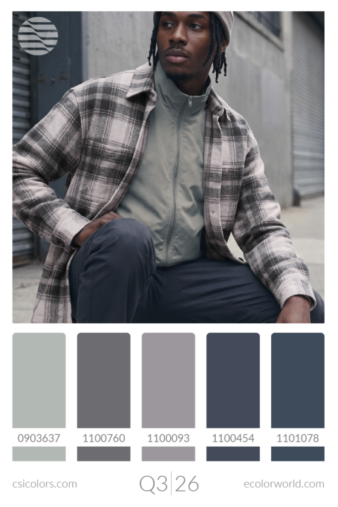
Spring/Summer 2028: Chromatic Fluidity & Atmospheric Botanicals
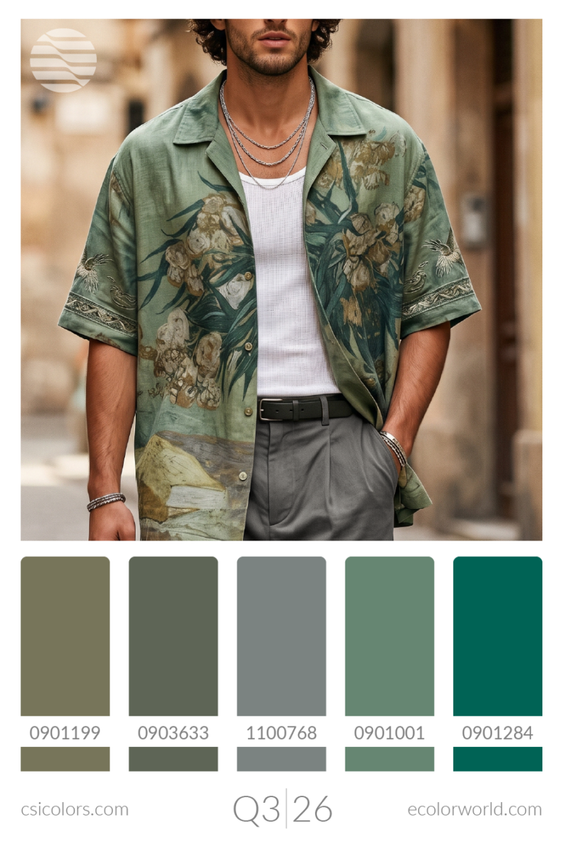
Looking further ahead to SS28, color boundaries become highly fluid and deeply tied to natural environments converging with digital lightness. Earthy greens shift toward botanical vibrancy with Mossy Oak, Eucalyptus, and Emerald. Purples lose their heavy winter weight, transforming into suspended, adaptable shades like Periwinkle, Lilac, and Mauve. The remaining transitional hues blend warm berries with cool mints and smokes, creating a soft, suspended tension.
Atmospheric Botanicals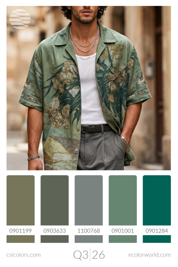
Chromatic Fluidity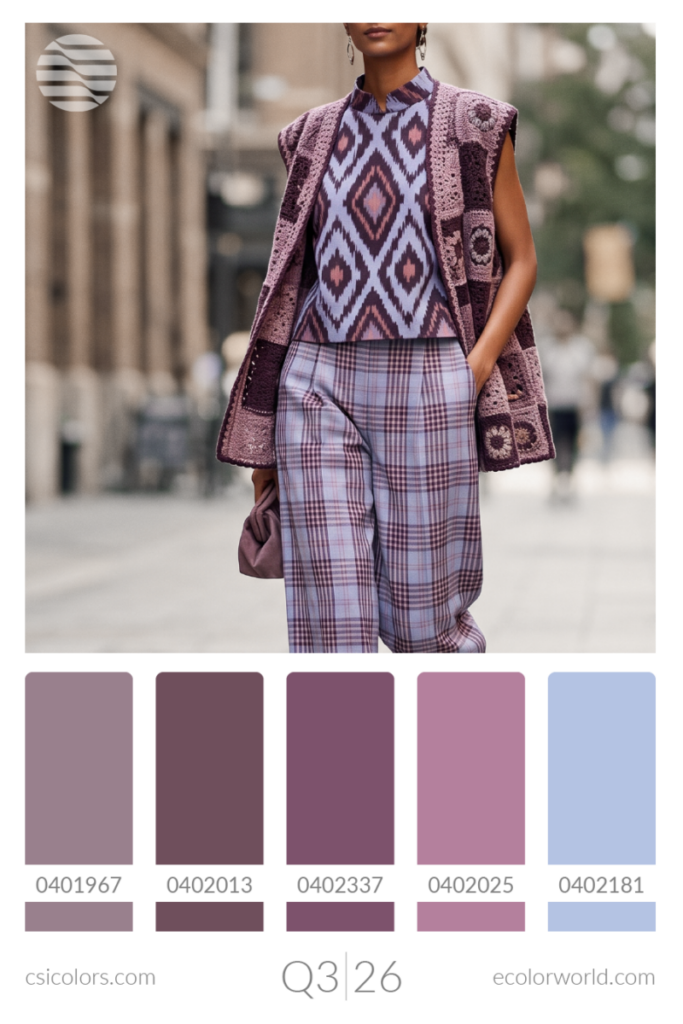
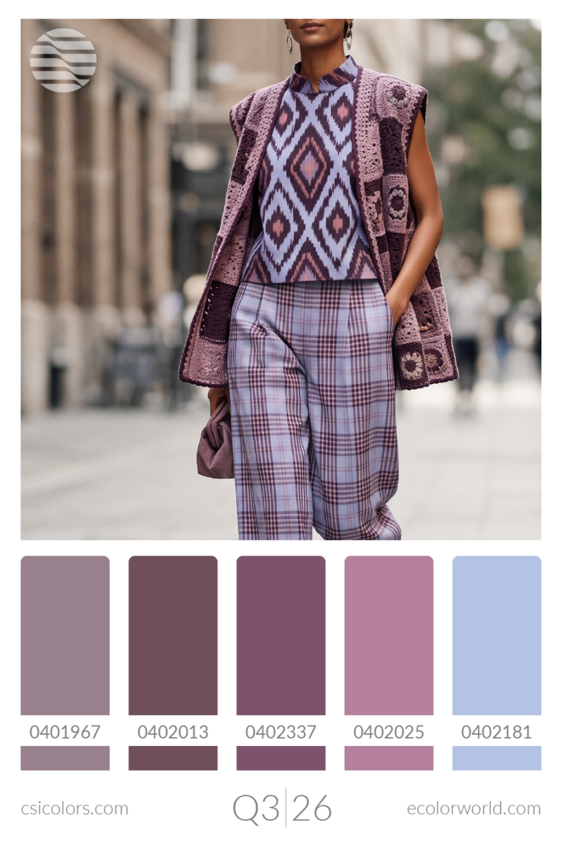
Soft Suspensions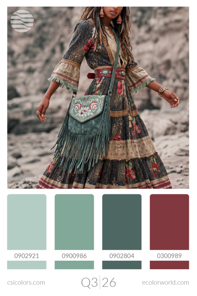
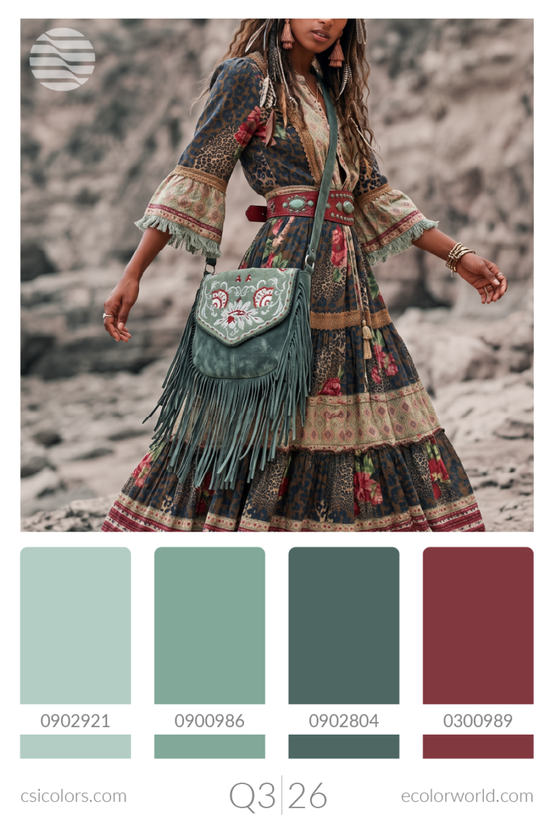
Trans-Seasonal: The Core Constant
Certain foundational hues defy seasonal constraints, operating as year-round anchors across multiple categories. In this transitional block, reliable Smokes balance against refreshing Mint and Powder Blue, providing versatile bridging colors that connect heavy winter assortments with early spring deliveries.
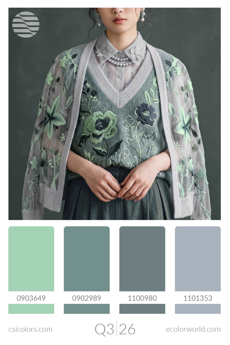
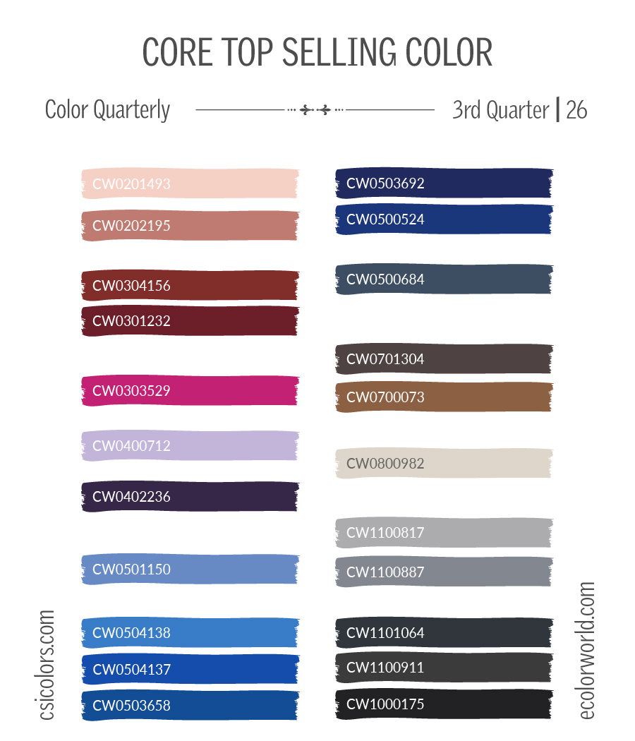
Aside from the popular Seasonal colors, the colors below from Q3 are a part of our Top Selling or Timeless Color reports and are popular across all seasons and palettes. To find out more about these, check out our Color Reports section.
To find out more about what CSI offers, please visit csicolors.com