
24 Jul Q2/26 – Leveled Up
In the fast-paced world of retail fashion, color is the ultimate silent salesperson. But building a cohesive, compelling collection requires more than just picking a few trending hues. It requires a strategic understanding of “color levels”—the art of taking a single core color and expanding it into a rich gradient of light tints, mid-tones, and deep shades. By leveraging these leveled palettes, designers and merchandisers can create depth, versatility, and visual harmony on the rack and in the campaign imagery.
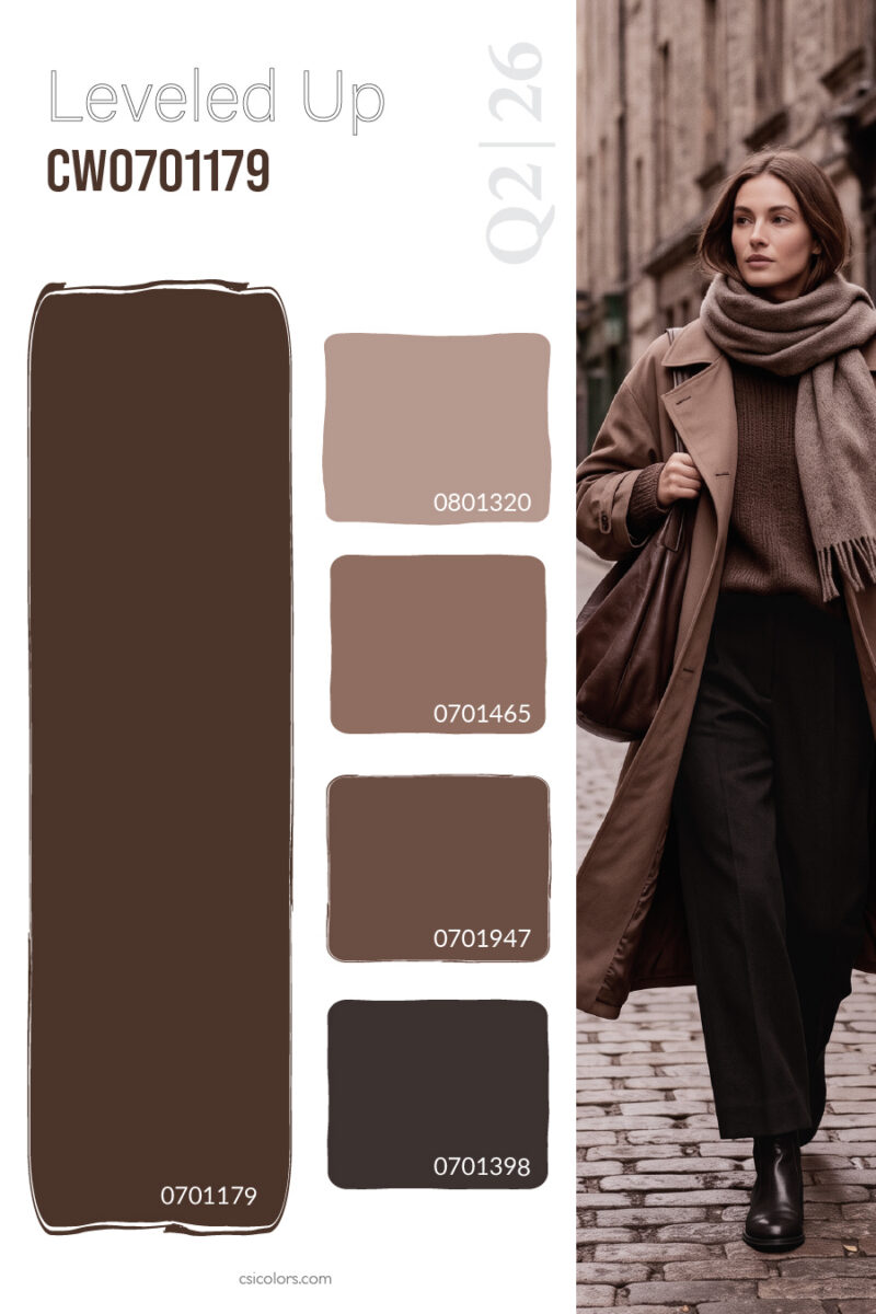
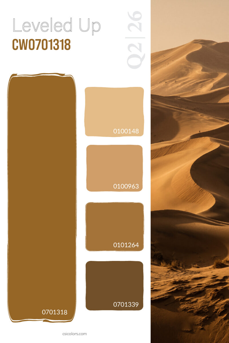
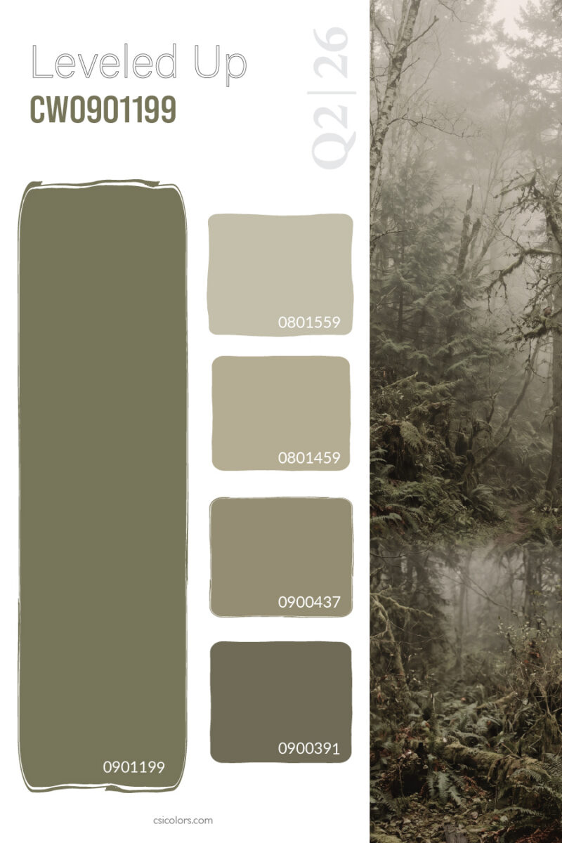
Earthy Foundations and Tonal Layering: Monochromatic dressing has become a staple of modern luxury, and leveled earth tones are at the heart of this trend. By offering apparel in varying depths of a single neutral, retailers allow customers to build effortlessly chic, tonal outfits. The layered, rich browns perfectly illustrate how a deep chocolate base can be softened into accessible taupes for chunky knits and structured coats. Similarly, the warm, sweeping camel and ochre tones inspired by desert landscapes provide a sun-baked gradient ideal for transitional seasons. Grounding the palette further, the misty, mossy greens show how leveled olive tones can evoke a natural, utilitarian aesthetic that feels both rugged and refined.
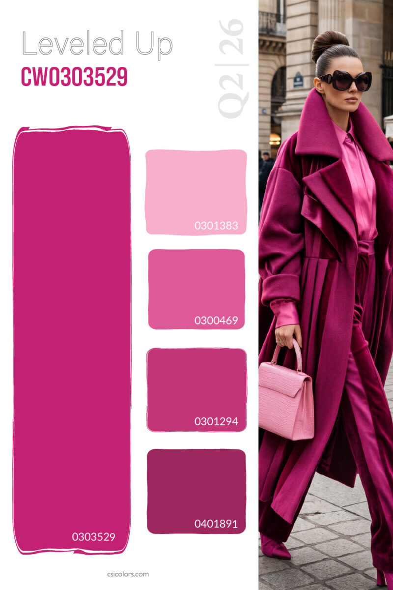
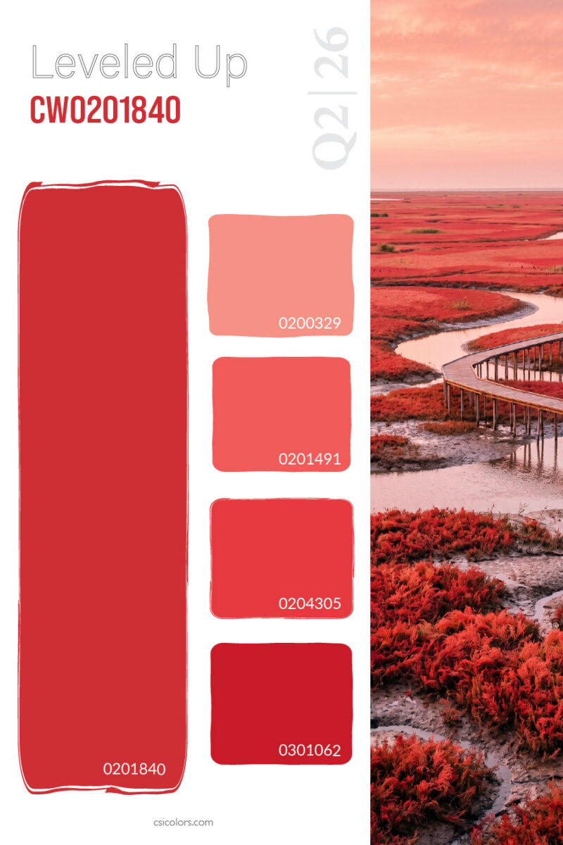
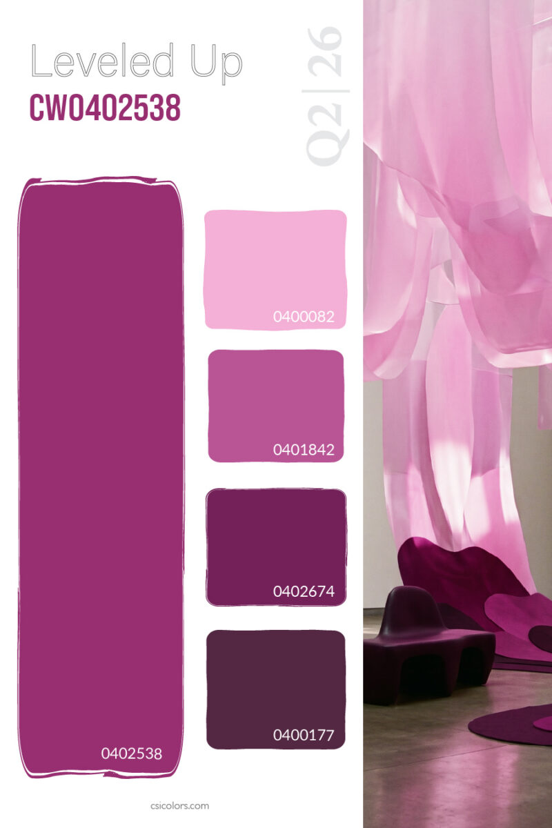
High-Impact Hues Made Accessible Bold colors can be intimidating for the average consumer, but color leveling provides an approachable entry point. When a retailer commits to a vibrant trend, breaking it down into levels ensures there is a piece for everyone. The striking fuchsia and magenta palette demonstrates how a daring, saturated coat can be perfectly merchandised alongside softer pink blouses and deep berry trousers. The same strategy applies to the energetic, fiery reds where a gradient from soft coral to deep crimson creates a dynamic, high-energy visual story. Even vivid orchid and plum purples, benefit from a leveled approach, turning a potentially overwhelming hue into a sophisticated, multi-dimensional collection.
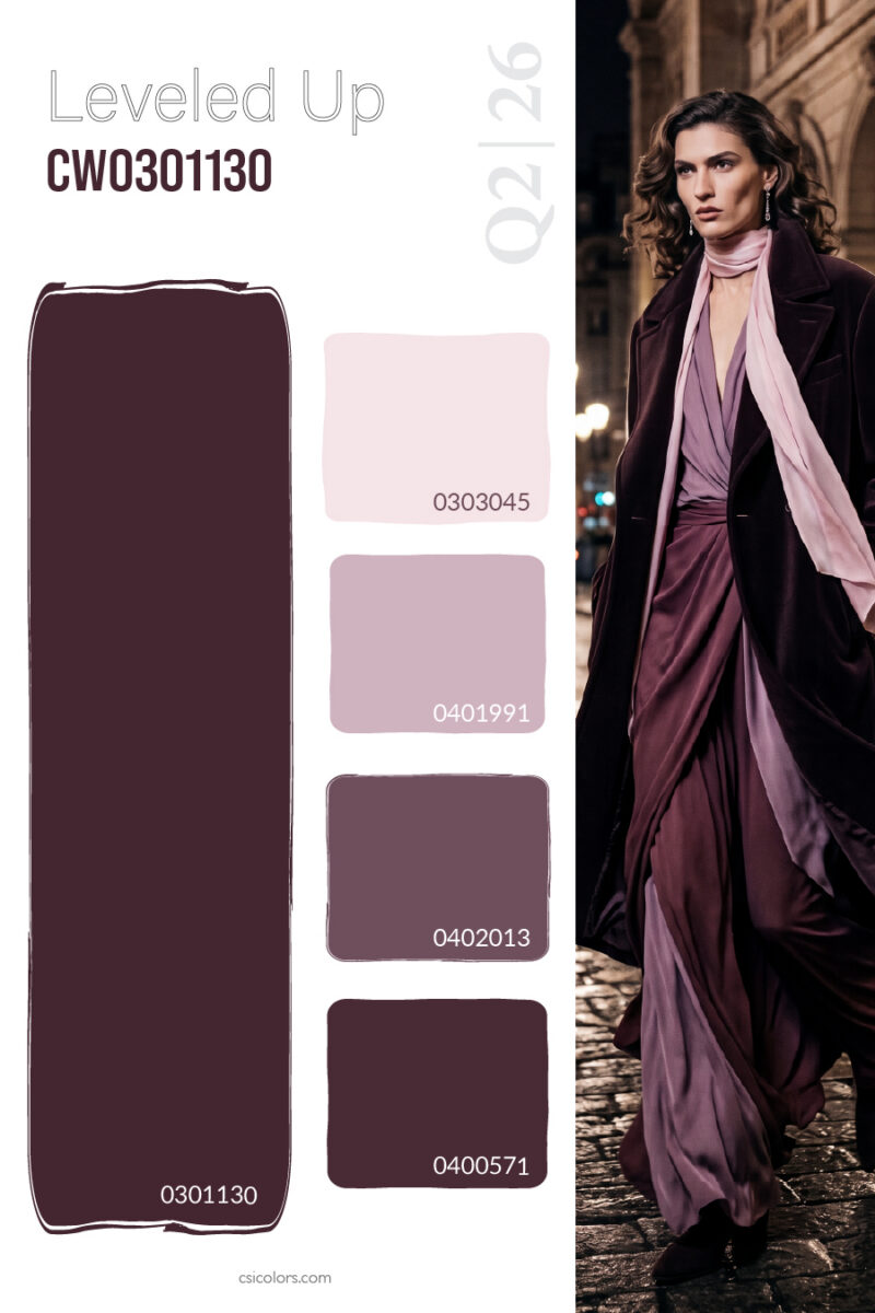
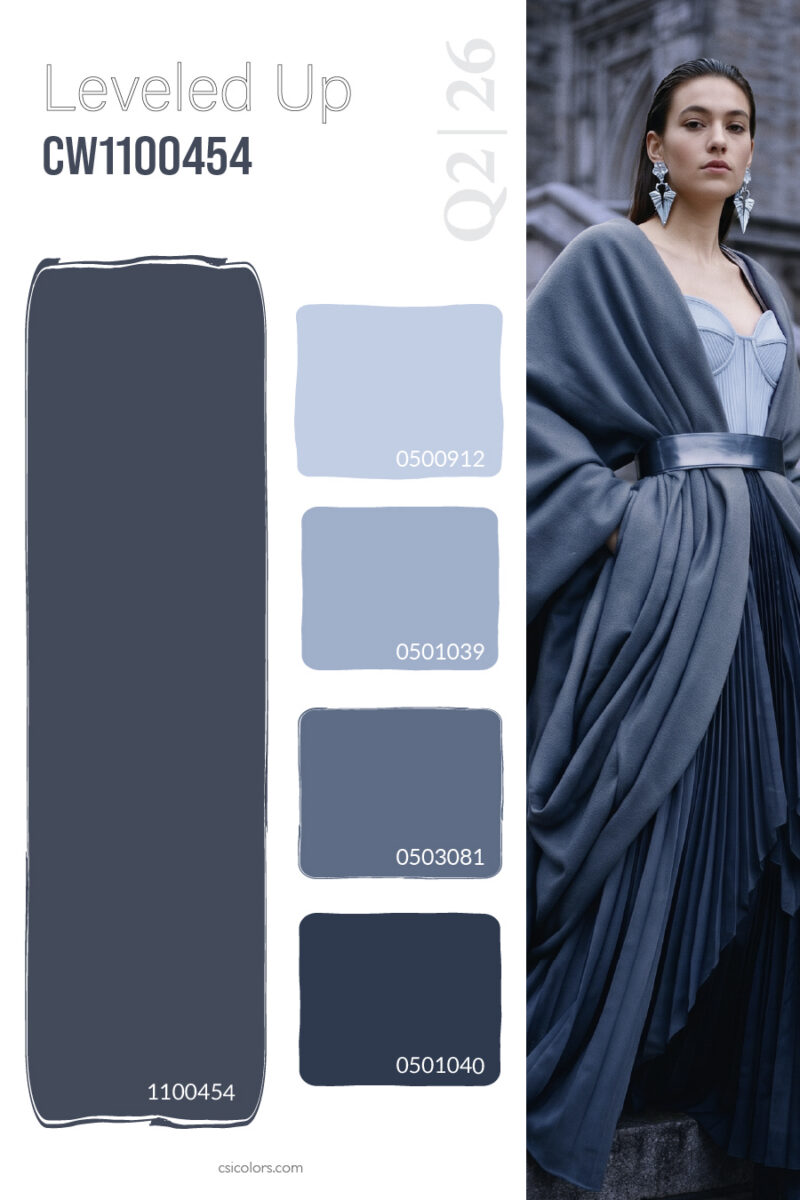
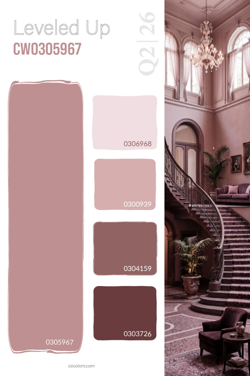
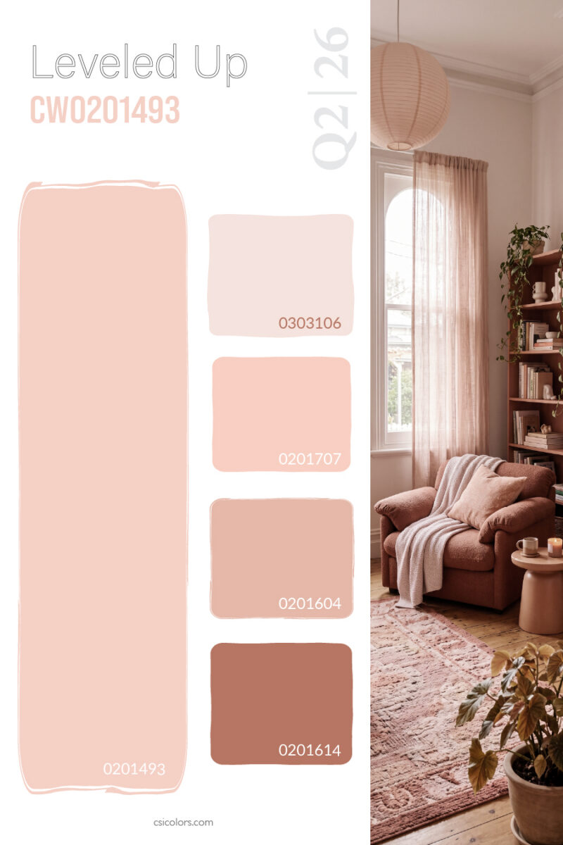
Moody Elegance and Soft Romantics Color levels are also instrumental in setting a specific mood or capturing a lifestyle aesthetic. For eveningwear and dramatic statement pieces, the deep plum and burgundy levels offer a rich, romantic scale that feels instantly luxurious. On the cooler side of the spectrum, the slate blue and grey tones provide a sense of draped, icy sophistication that works beautifully for modern, architectural silhouettes. Finally, the crossover between fashion and lifestyle interior aesthetics is captured perfectly by the dusty mauve levels and the soft, inviting peach tones. These gentle gradients evoke a calming, romantic vibe that appeals to consumers looking for comfort and subtle elegance.
By designing in levels, retail brands don’t just sell an item—they sell a cohesive wardrobe ecosystem. It empowers the consumer to mix and match with confidence, knowing that the tones were purpose-built to harmonize beautifully.
To find out more about what CSI offers, please visit csicolors.com