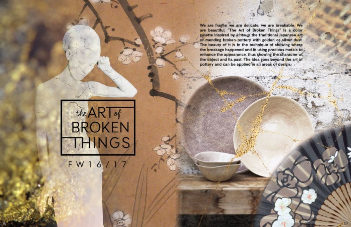
07 Jan Autumn/Winter 2016-2017 | The Art of Broken Things
“The Art of Broken Things” is a color palette inspired by kintsugi the traditional Japanese art of mending broken pottery with golden or silver dust. The beauty of it, it’s in the technique showing where the breakage happened and in using precious metals to enhance the appearance, thus showing the character of the object and its past. The idea goes beyond the art of pottery and can be applied in all areas of design.
The designs are simplistic but sophisticated, the lines are clean and elegantly flowing. Embroidery and stitching with threads, imitating gold or silver, is a key element for conveying the idea of mending with gold. All has to be done with taste and artistry, so the final effect is not to elaborate or flashy.

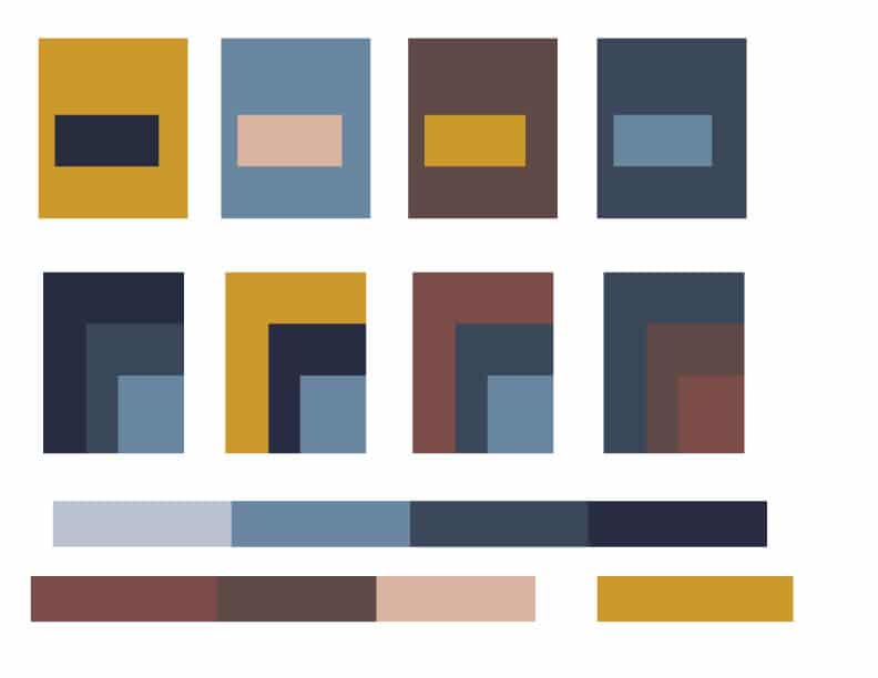
In “The art of broken things’’ the colors and the theme are equally important. The presence of the golden yellow in the mix of tranquil blues and earthy browns is essential. The softer tonals contribute for the overall subtle elegance of the palette.
CLICK HERE TO FIND THE COLORWALL COLORS INCLUDED IN THIS PALETTE
COLOR COMBINATIONS: