
06 Nov Q3/26 Leveled Up: The Art of Tonal Palettes in Retail Fashion
Retail fashion is embracing the sophisticated art of tonal leveling. Instead of pairing wildly contrasting hues, this compelling visual merchandising strategy relies on color levels—taking a single anchor color and cascading it across four distinct intensities. This tonal approach allows designers to build immense depth within a collection, offering consumers everything from ethereal, barely-there tints for delicate silks to rich, grounding shades for heavy outerwear, all within the same harmonious color family.
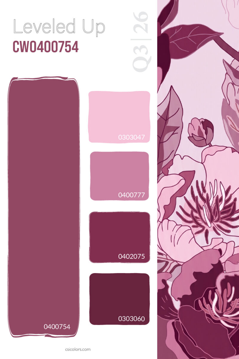
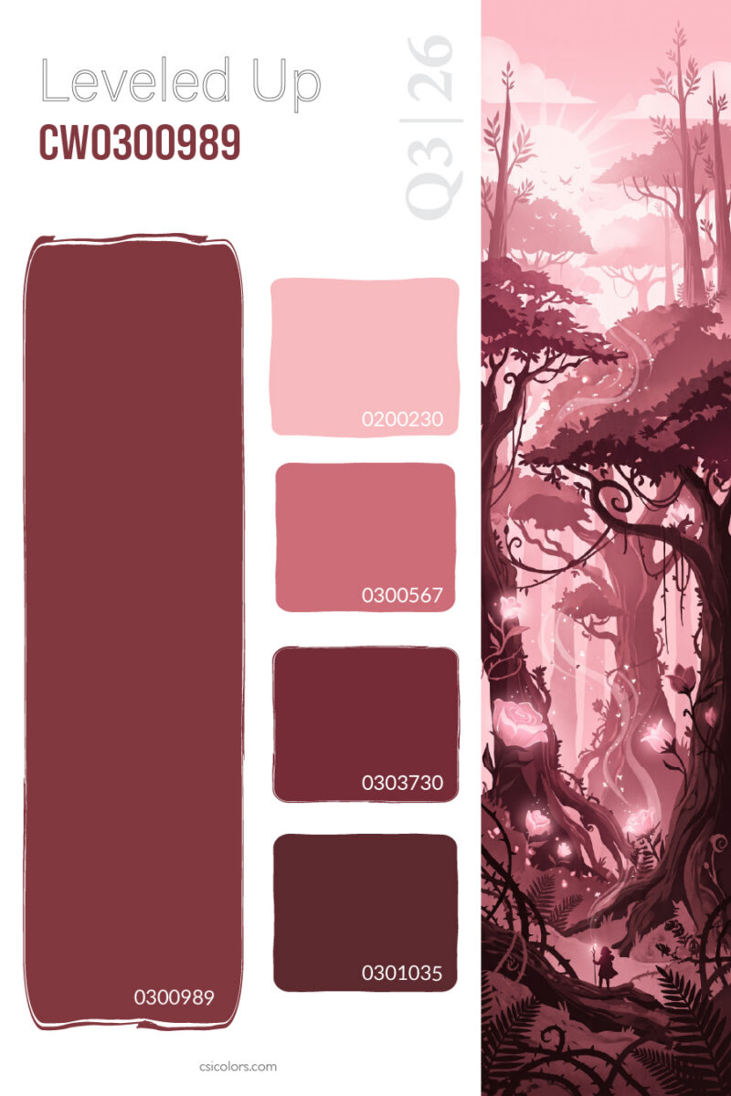
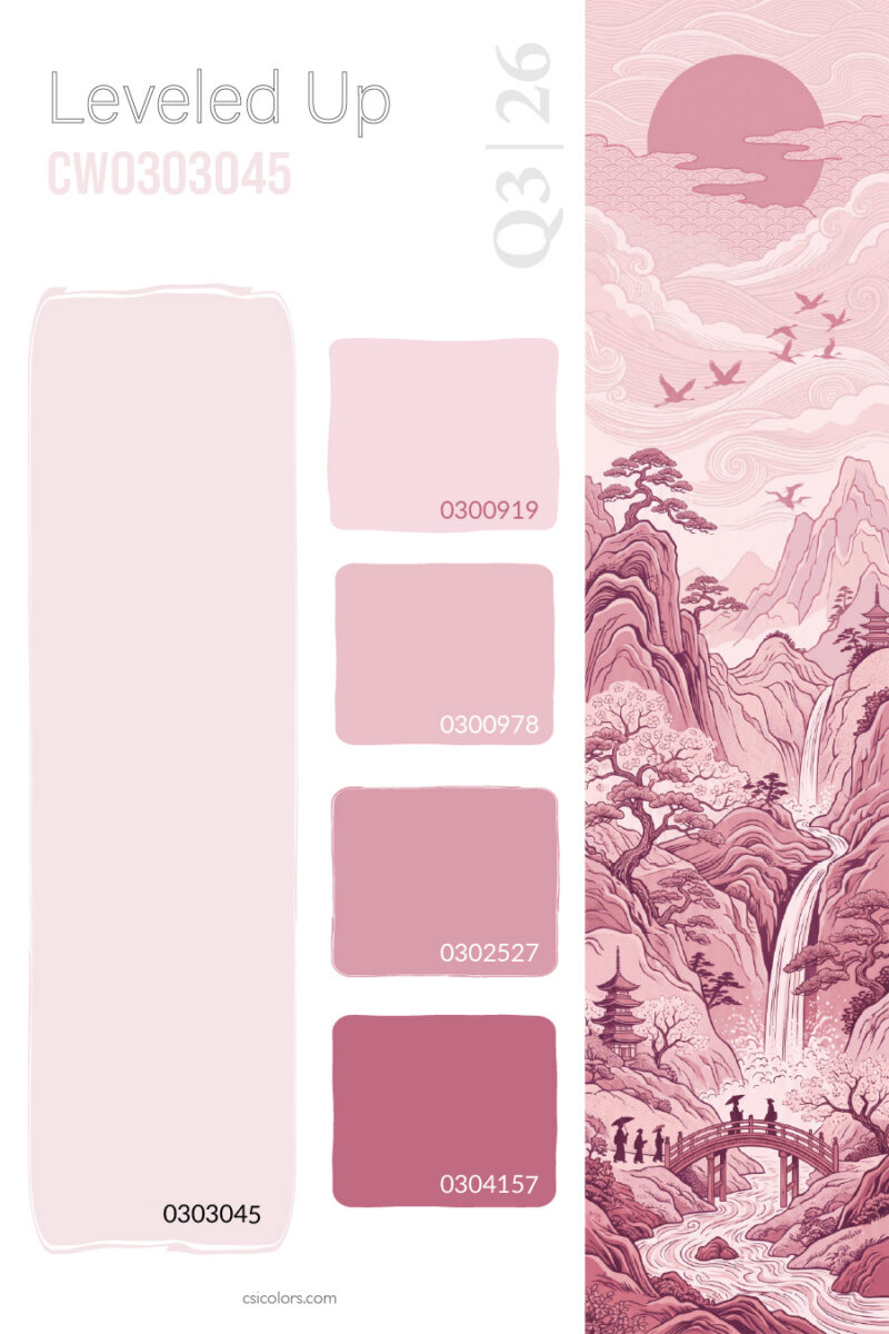
A striking example of this depth is found in romantic, floral-inspired palettes. In the mauve and plum spectrum, a delicate light pink seamlessly steps down into a deep, moody burgundy, creating versatile pieces that flow elegantly across a floorset. This gradient is echoed in enchanted forest tones, which ground a soft blush with a robust, dark wine hue. For a more tranquil, landscape-inspired take on the color family, cherry blossom pinks level down into a vibrant raspberry, offering a softer, dreamier aesthetic for knits and loungewear.
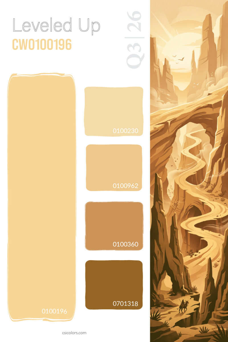
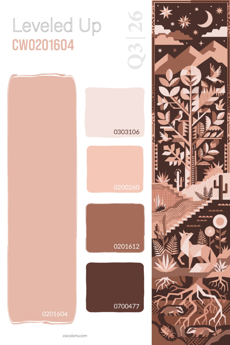
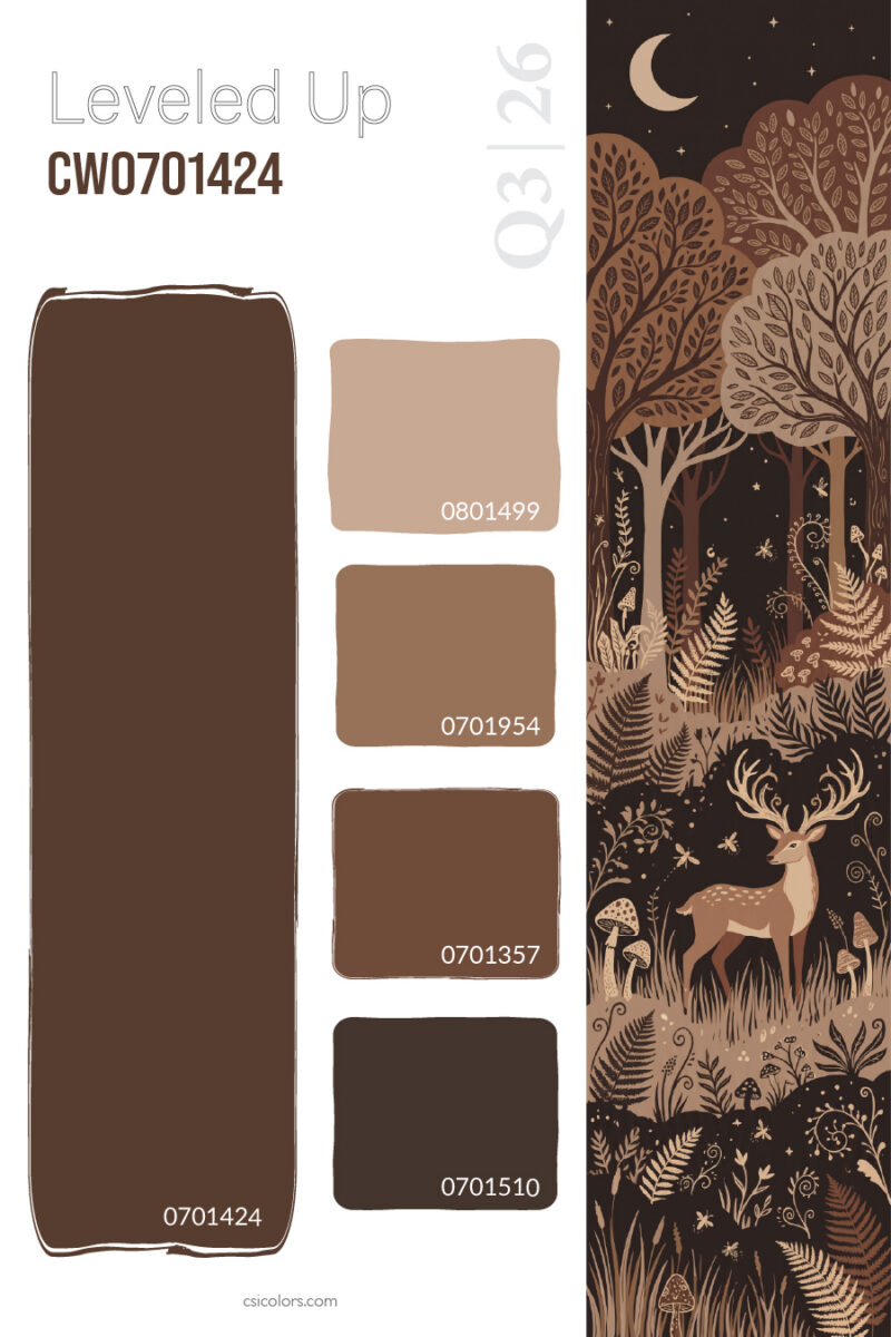
The narrative also draws heavily from the raw, baked warmth of the earth, proving that neutrals never have to feel flat when properly leveled. Desert canyon golds show how a pale, sun-bleached yellow can anchor a palette that descends into rich camel and dark brown, providing a flawless foundation for suede and linen capsules. This baked warmth continues in terracotta and clay gradients, where pale peach gradually evolves into a deep, grounding rust. For a darker, more rugged approach, woodland browns step from a soft tan down to an intense dark chocolate that naturally translates into heavy boots and leather accessories.
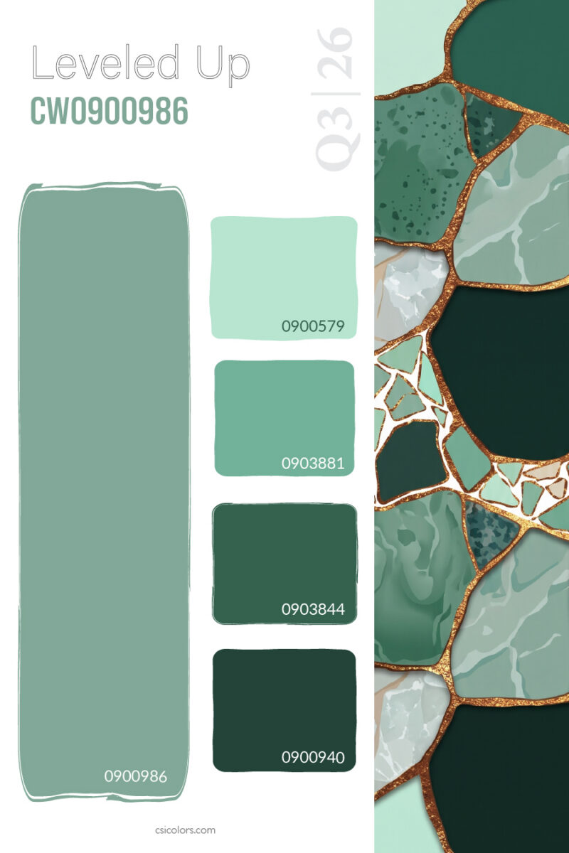
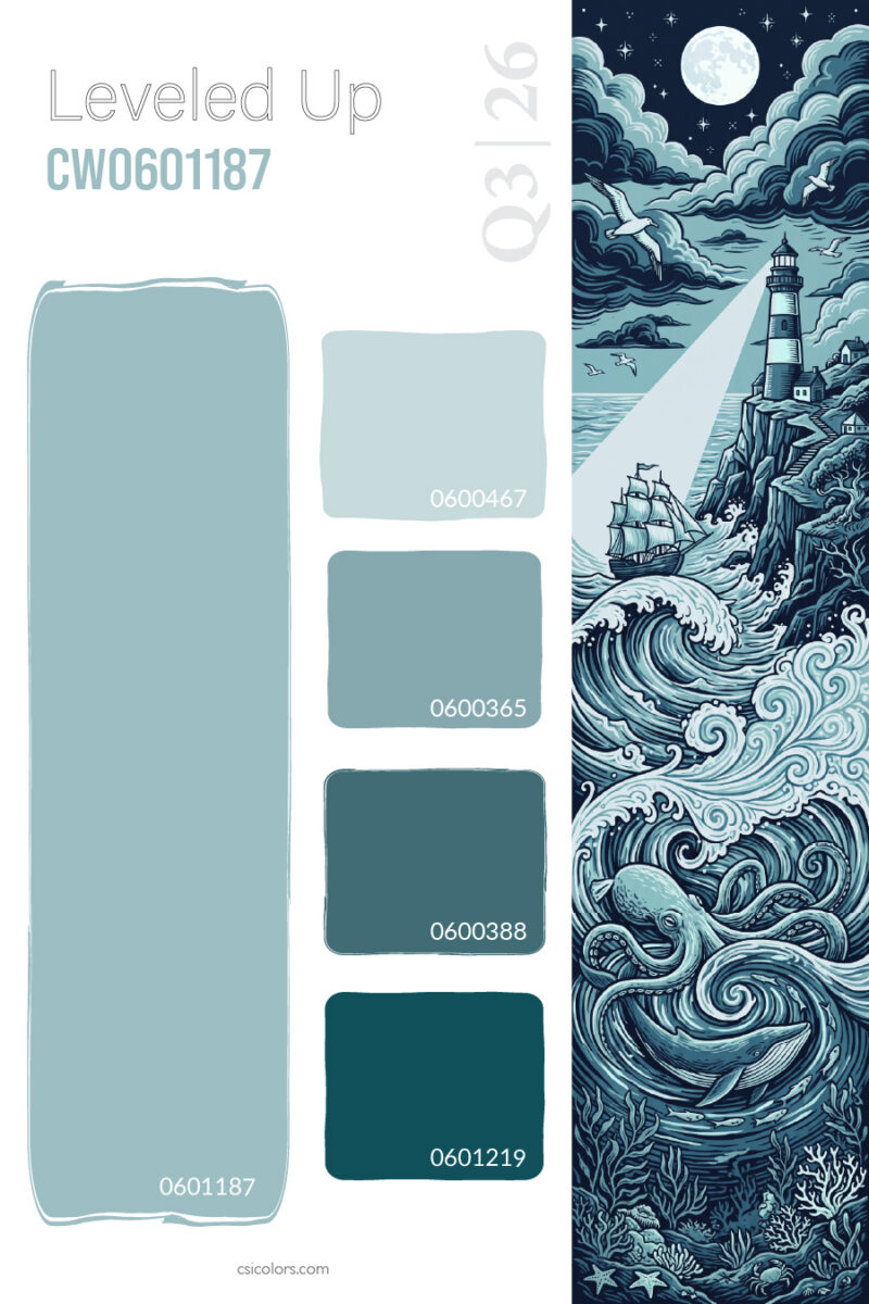
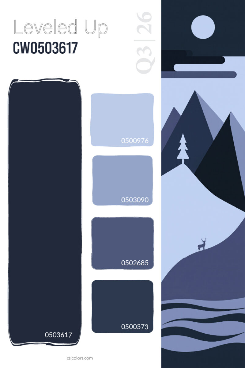
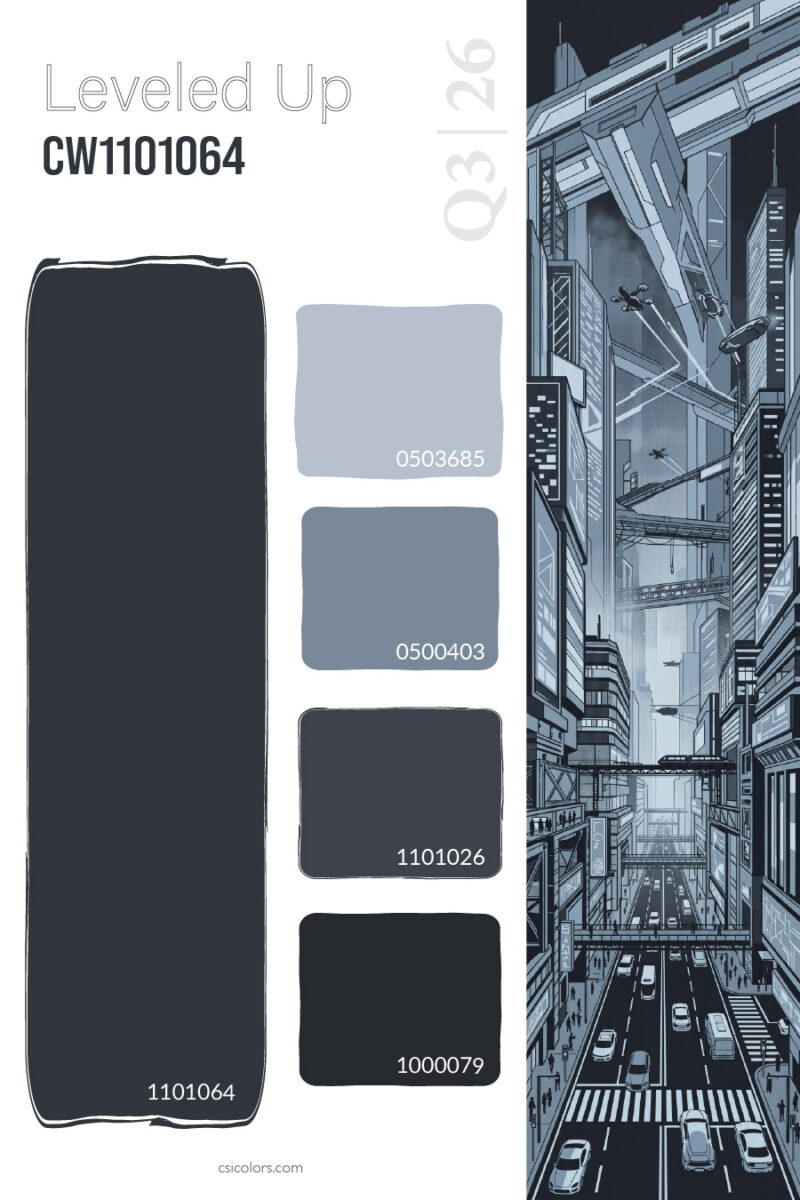
Balancing the warmth of the earth tones are atmospheric cool levels, bringing a sense of calm and structure to retail displays. Marbled, botanical themes demonstrate how sage green can be stretched from a frosty mint all the way to a dense, shadowy forest green. Moving into the blues, ocean-inspired palettes capture a turbulent energy with an icy slate that drops into a profound navy teal. A quieter, more twilight-inspired blue is captured in mountain-themed gradients, transitioning from a soft periwinkle into an endless midnight indigo. Finally, to give collections a sharp, futuristic edge, sci-fi inspired charcoal gradients prove that even greys and blacks can be richly leveled to create a sleek, metropolitan color story.
Ultimately, the color level strategy is about creating an immersive, sensory experience for the shopper. By providing a built-in tonal roadmap across these diverse palettes, retailers allow consumers to effortlessly mix and match within a color family, building a wardrobe that feels curated, deeply intentional, and undeniably leveled up.
To find out more about what CSI offers, please visit csicolors.com